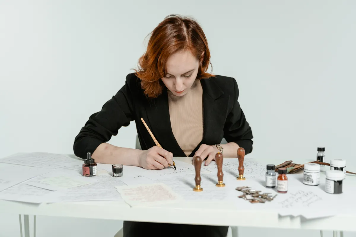
Spencerian small letters look like they were drawn in one easy breath: narrow, rounded, and joined by thin, quiet lines. They are not as easy as they look. Spencerian lowercase letters reward a light hand, a steady slant, and a lot of slow, careful rows.
This guide is part of Spencerian Calligraphy. You will learn what makes the small letters distinctive, which strokes build them, a sensible practice order, the tricky letters, and how to keep slant and spacing even.
I remember the week my downstrokes finally stopped shaking. After that, the small letters stopped feeling like a puzzle and started feeling like a rhythm.
Spencerian Lowercase Letters: What This Covers
Spencerian is a pointed-pen script, named after Platt Rogers Spencer, who taught handwriting in the United States in the 1800s. Teachers and books describe it a little differently, so treat the numbers below as common starting points.
What makes the lowercase letters distinctive? They are built mostly from ovals and gentle curves. They tend to be narrow, light, and flowing, with thin joining lines. Shading, which is the thick part of a stroke made with pressure, is used more sparingly than in some other pointed-pen scripts.
|
Feature |
Spencerian lowercase |
|
Tool |
Pointed pen with a flexible nib |
|
Slant |
Often about 52 degrees |
|
Main shape |
Oval and gentle curves |
|
Shading |
Light and sparing |
|
Joins |
Thin, smooth connecting lines |
|
Movement |
Whole forearm, not just fingers |
Spencerian is related to Copperplate, but the feel is different. The letters are lighter and rounder, and the rhythm is calmer. If you know one, some skills carry over to the other.
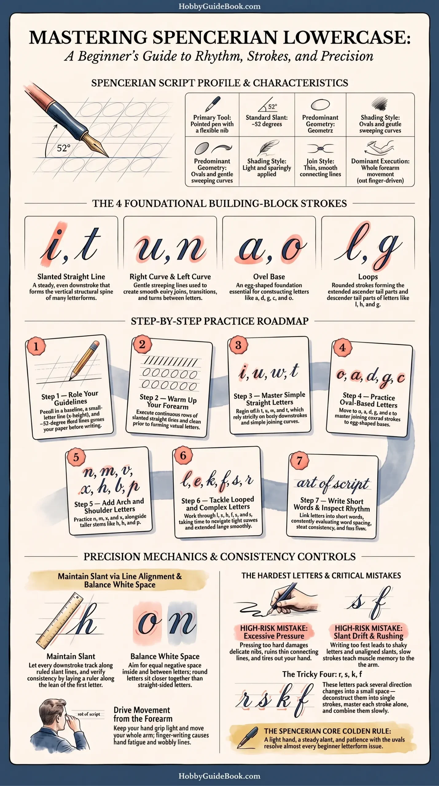
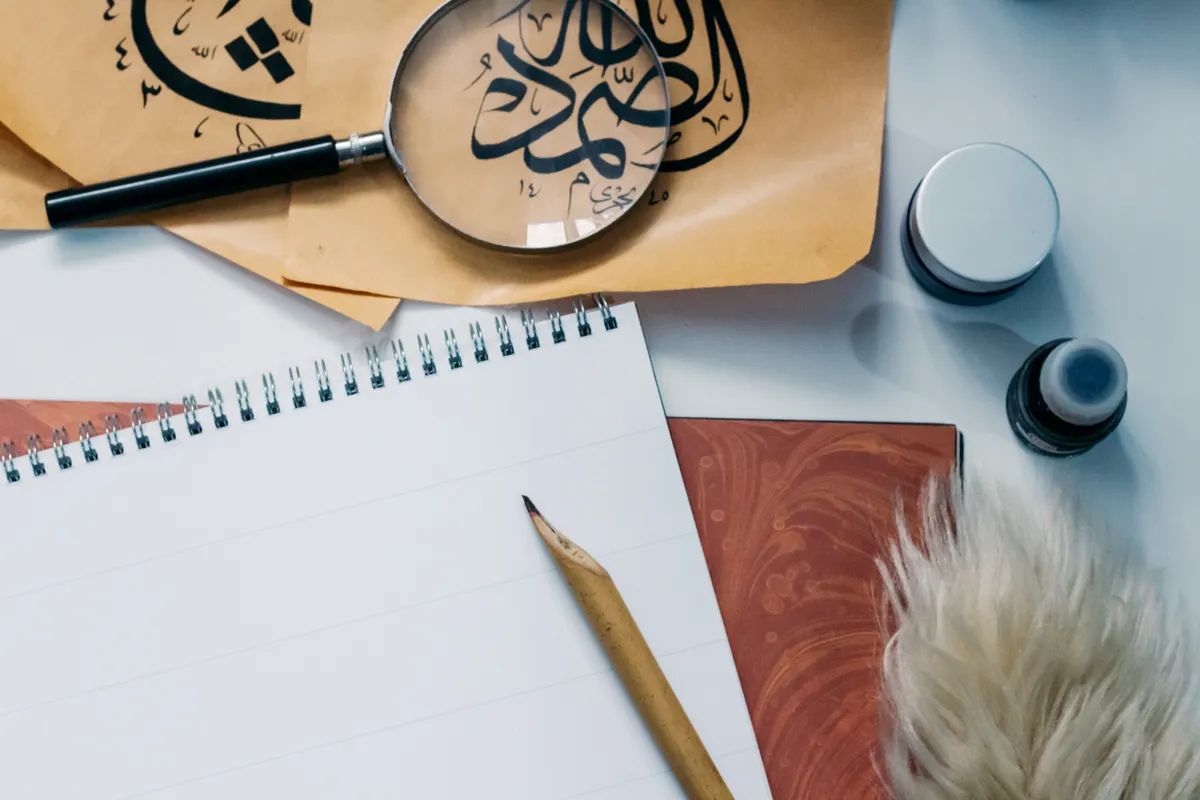
Photo Credit: Hobby Guidebook Editorial
The Basic Strokes Behind Every Letter
Names vary from book to book, but most small letters are made from a few simple strokes:
- Slanted straight line: a steady, even downstroke.
- Right curve and left curve: gentle sweeping lines, used for joins and turns.
- Oval: the egg-shaped base of letters like a, d, g, and o.
- Loops: the rounded tall and tail parts of l, h, and g.
Practice these on their own before you link them into letters. A clean oval is worth more than ten rushed words.
Step-by-Step Practice
Work through the letters in small groups. Spend a few days on each step, and move on when your rows look steady.
- Rule your guidelines. Draw a baseline, a small-letter line, and slant lines in pencil.
- Warm up. Draw slanted lines and rows of ovals before any letters.
- Start with simple letters. Try i, u, w, and t, which use straight lines and curves.
- Move to the oval letters. Practice o, a, d, g, and c.
- Add the arch letters. Work on n, m, v, and x, along with h, b, and p.
- Finish with the looped and tricky ones. Take your time with l, e, k, f, s, and r.
- Write short words. Check spacing and slant across the whole word.
This is one common order, not the only one. Follow your own model sheet if it groups the letters differently.
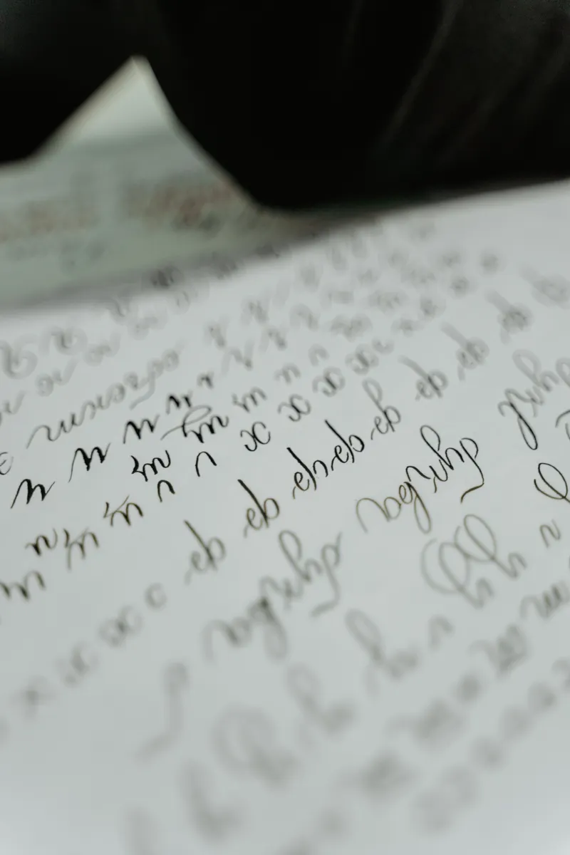
Photo Credit: MART PRODUCTION
Which Letters Are Hardest?
Many learners find r, s, k, and f the trickiest, because they pack several curves into a small space. Tall looped letters also take patience, since the loop needs a smooth, even shape. Your hardest letters may be different, and that is normal. Break a stubborn letter into its strokes, draw each part alone, and join them slowly.
How to Keep Slant and Spacing Consistent
Slant lines are your best friend. Rule them across the page, and let every downstroke follow one. After each row, lay a ruler along the lean of your first letter and compare the rest.
For spacing, aim for even white space between letters, not equal distance between edges. Round letters sit a little closer than straight ones. Squint at the row from arm's length, and uneven gaps jump out.
Move from your forearm, and keep your grip light. A tight grip makes shaky lines and tires your hand fast. If your lines wobble, slow down instead of pressing harder.
Pointed nibs are sharp, so keep the tip away from your fingers and cover it when you finish. Ink stains too, so protect your desk and sleeves.
Photo Credit: Katya Wolf
Common Uses
Lowercase Spencerian makes up most of any finished piece, so it sets the tone for names, quotes, and letters. Capitals come once the small letters are steady, and Spencerian capital letters covers them. When you want to add decoration to a finished piece, Spencerian flourishing is the next step.
Common Mistakes to Avoid
- Pressing too hard. It ruins thin lines and tires your hand.
- Letting slant drift. Rule slant lines, and follow them.
- Using only your fingers. Small finger moves make shaky letters.
- Rushing. Slow strokes teach your arm the motion.
Light hand, steady slant, and patience with the ovals.
That is the whole recipe in a line. Most problems in small letters trace back to one of those three things.
Frequently Asked Questions
What makes Spencerian lowercase letters distinctive?
They are built on ovals and gentle curves, they are narrow and light, and they use thin joins and sparing shading.
Which Spencerian lowercase letters are hardest?
Many learners find r, s, k, and f hardest, along with tall looped letters.
What basic strokes build Spencerian lowercase letters?
Slanted straight lines, right and left curves, ovals, and loops.
How do you maintain Spencerian slant and spacing?
Rule slant lines, check rows with a ruler, and aim for even white space between letters.
Start With One Row
You do not need the whole alphabet at once. Rule your slant lines, draw a clean row of ovals, and build from there.
When you are ready for the bigger picture, read the full calligraphy & hand lettering guide.



Leave a Reply