You finish a lovely line of Italic lettering, then write a date at the bottom, and the numbers look like they wandered in from a different page. It happens to almost everyone. Italic numerals need the same pen angle and lean as your letters, plus a few small habits of their own.
This guide is part of Italic Calligraphy. You will see how numbers are built, whether they share the letter slant, which strokes matter most, and how to practice them.
I still have the first alphabet sheet I ever filled in, ink blotches and all. The numbers at the bottom were always the messiest part, which tells you how often they get skipped.
Italic Numerals: What This Covers
Italic is written with a broad-edge pen, which has a flat tip. The thick and thin parts of each line come from the angle of that edge, not from pressure. Numerals follow the same rule, so a steady pen angle matters here as much as it does for letters.
Styles and teachers vary, and so do number shapes. Some guides show numbers about as tall as capital letters, and others make them a little shorter. Follow the model sheet you are learning from, and treat the points below as common starting places.
|
Feature |
Italic numerals |
|
Tool |
Broad-edge pen or nib |
|
Pen angle |
Often about 45 degrees, kept steady |
|
Slant |
Usually the same lean as the letters |
|
Height |
Often close to capital height, but it varies |
|
Main shapes |
Ovals, arches, and straight lines |
|
Look |
Narrow, even, and quick to read |
In many guides, numbers are also written to match the rest of the line in weight and rhythm. When the pen angle and lean match, a date or a price looks like it belongs.
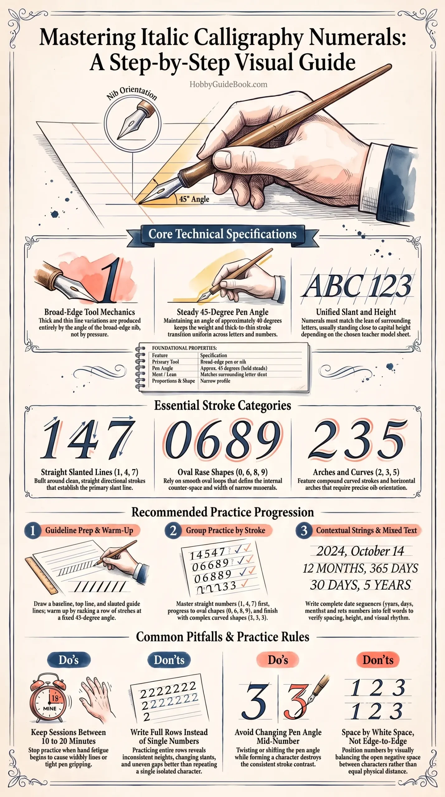
Photo Credit: Hobby Guidebook Editorial
Do Italic Numerals Share the Same Slant as Letters?
In most guides, yes. Italic numerals lean the same way as the letters around them. A common starting point is a slight lean, but exact amounts differ from teacher to teacher. Rule light slant lines on your practice sheet, and let each number follow one.
If a number looks off, the slant is often the cause. Hold a ruler along the lean of your first number, then compare the rest.
Which Strokes Matter Most?
Numbers use the same strokes as letters, so skills carry over. The key ones are:
- Straight slanted lines: used in 1, 4, and 7.
- Ovals: the base of 0, 6, 8, and 9.
- Arches and curves: used in 2, 3, and 5.
The calligraphy numbers and numerals guide shows how numbers work across scripts, which helps if you also write other styles.
Step-by-Step Practice
Work through numbers in small groups. Spend a few days on each step, and move on when your rows look steady.
- Rule your guidelines. Draw a baseline, a top line, and light slant lines.
- Warm up with pen angle lines. Make a row of lines at a steady angle.
- Start with straight numbers. Try 1, 4, and 7.
- Move to oval numbers. Practice 0, 6, 8, and 9.
- Add the curved numbers. Work on 2, 3, and 5.
- Write short number strings. Try dates, like a year or a day and month.
- Mix numbers with letters. Check height and spacing across the line.
This is one common order, not the only one. Follow your own model sheet if it groups the numbers differently.
Photo Credit: Tatiana Syrikova
How Should You Practice Italic Numbers?
Short, regular sessions of 10 to 20 minutes work well. Tired hands pick up bad habits, so stop when your lines begin to wobble. Practice whole rows, not single numbers, because a row shows whether your size and lean stay even.
Once the numbers feel steady, go back to full words. The Italic alphabet practice page is a good place to mix letters and numbers together.
Common Mistakes to Avoid
- Changing the pen angle mid-number. It ruins the thick and thin pattern.
- Making numbers too wide. Italic shapes are narrow, so check each one.
- Mixing slants. Letters and numbers should lean the same way.
- Uneven spacing. Space numbers by white space, not edge to edge.
- Gripping too tight. A squeezed pen makes shaky lines.
Dip pen nibs are sharp, so cover the tip when you finish, and keep it away from your fingers. Use ink made for dip pens, and follow the maker's directions.

Photo Credit: Katya Wolf
Common Uses
Italic numerals turn up on invitations, certificates, place cards, and handmade cards. They are most useful for dates, addresses, and short sums. Because a line of numbers is short, small mistakes show up fast, so check each one against its neighbors before you move on.
A quick way to review your work is to write the numbers 0 to 9 in a row. Compare the height, the lean, and the gaps. Then write your birth year or a favorite date, and compare again. Real examples show problems that a plain row sometimes hides.
A date is only as neat as its worst number.
It is a good reminder to slow down. One crooked 5 can pull a whole line off balance.
Frequently Asked Questions
How are numerals written in Italic calligraphy?
With a broad-edge pen held at a steady angle, using ovals, arches, and straight lines in the same narrow, leaning style as the letters.
Do Italic numerals share the same slant as letters?
In most guides, yes. Numbers lean the same way as the letters around them.
Which strokes are important for Italic numerals?
Straight slanted lines, ovals, and arches or curves.
How should you practice Italic numbers?
Rule slant lines, practice in groups by shape, write whole rows, and then try dates mixed with letters. Sessions of 10 to 20 minutes work well.
Start With One Row
You do not need all ten numbers at once. Rule your slant lines, write a clean row of 1s, and build from there.
When you are ready for the bigger picture, read the full calligraphy & hand lettering guide.






Leave a Reply