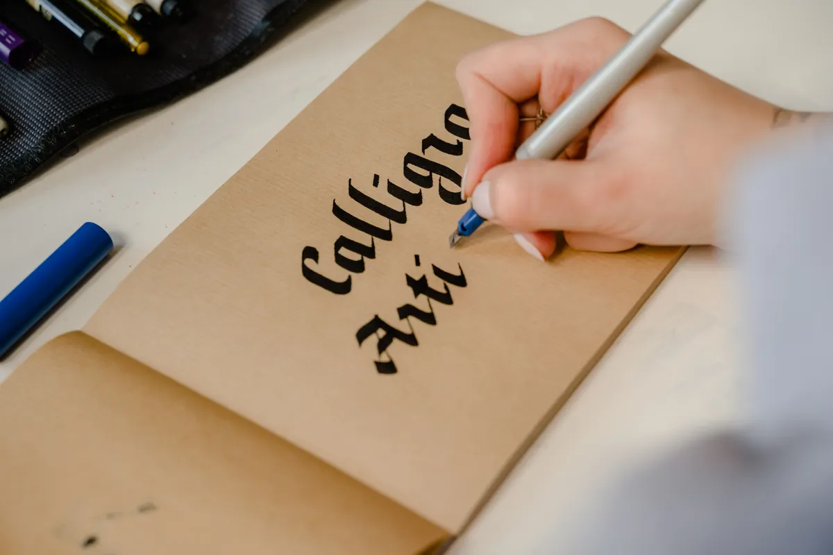
I still remember the first time I tried Blackletter after years of pointed pen work, and my hand kept trying to add curves that had no business being there. Blackletter basic strokes work almost nothing like the flowing scripts I was used to, relying instead on angular, repeating shapes built from a flat, broad edge nib.
This guide is part of Gothic (Blackletter) Calligraphy, and it covers the core strokes, pen angle, and tools behind this bold, structured script.
What Basic Strokes Form Blackletter Letters
Blackletter basic strokes rely on a small set of repeating shapes, mostly straight diagonal lines, sharp corners, and short connecting hairlines. Unlike pointed pen scripts that build letters from curves and pressure changes, Blackletter forms nearly its entire alphabet from these same handful of angular pieces.
This is one of the clearest examples of gothic script strokes in the wider calligraphy world, since the shapes stay so consistent across almost every letter in the alphabet.
Background on Blackletter's Angular Style
Blackletter developed in medieval Europe as a dense, space saving script used heavily in religious and legal manuscripts. That history explains its tightly packed, angular letters, since scribes needed to fit as much text as possible onto expensive parchment.
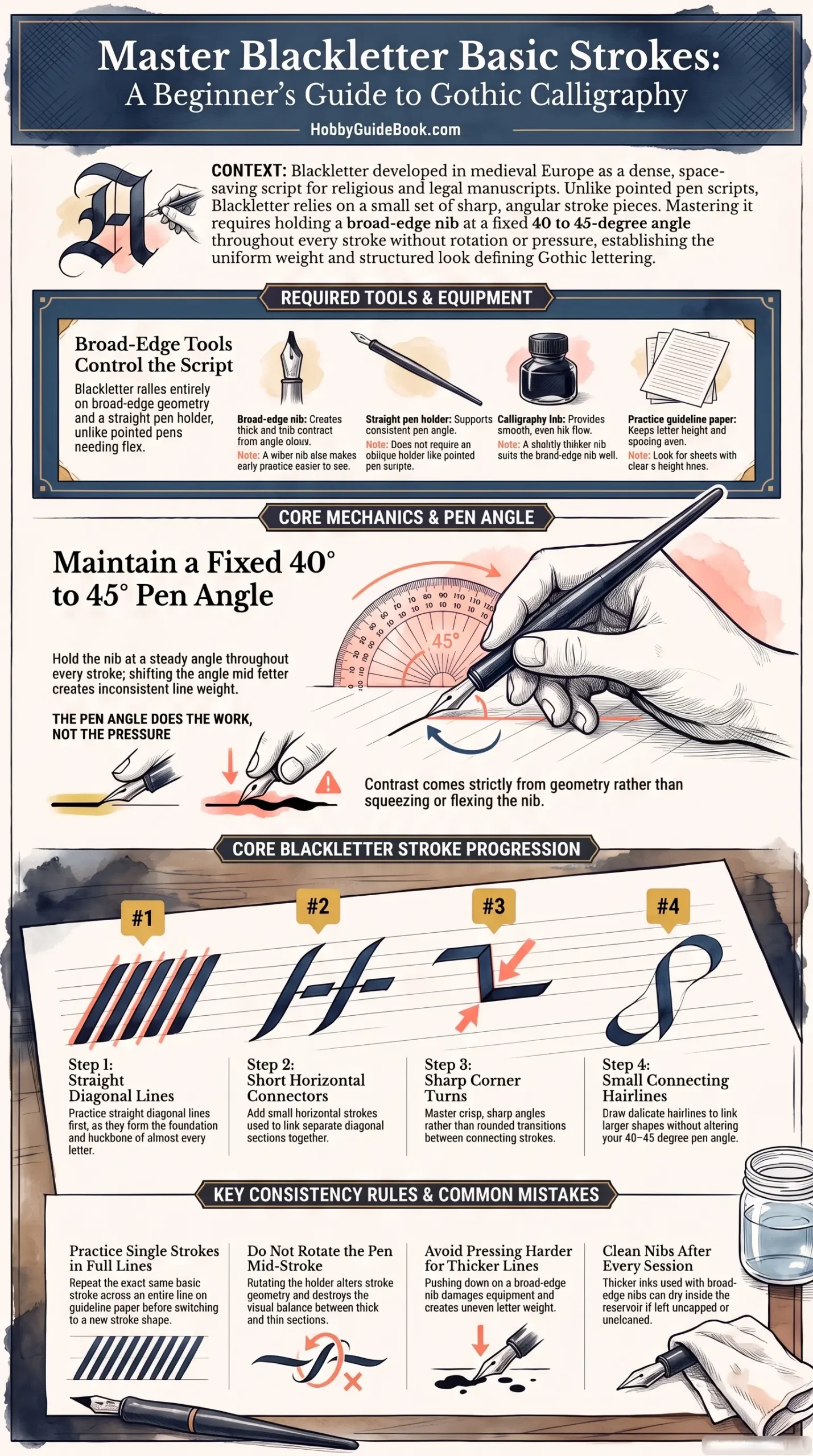
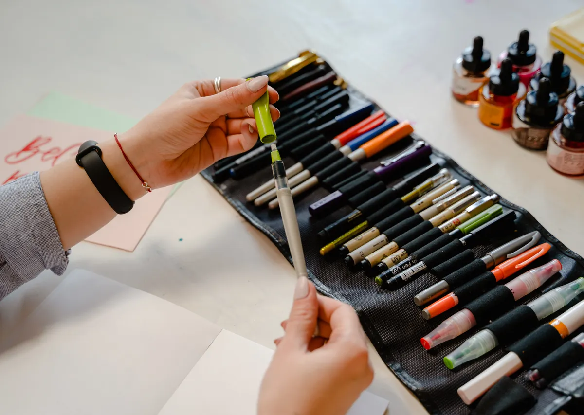
Photo Credit: Hobby Guidebook Editorial
For a look at how these basic strokes come together into full letterforms, Blackletter Alphabet Practice walks through building the complete alphabet from this same stroke set.
Tools for Practicing Blackletter Strokes
|
Tool |
Purpose |
Notes |
|
Broad-edge nib |
Creates thick and thin contrast from angle alone |
A wider nib size makes early practice strokes easier to see |
|
Straight pen holder |
Supports consistent pen angle |
Blackletter does not require an oblique holder like pointed pen scripts |
|
Calligraphy ink |
Provides smooth, even ink flow |
A slightly thicker ink suits the broad edge nib well |
|
Practice guideline paper |
Keeps letter height and spacing even |
Look for sheets with clear x-height lines |
Choosing the right nib matters more here than in many other scripts, and Calligraphy Pens: Types & How to Choose covers how broad edge options compare to pointed pens in more detail.
What Pen Angle Is Used for Blackletter
Blackletter typically uses a consistent 40 to 45 degree pen angle held steady throughout every stroke, rather than shifting angle mid letter like some other broad edge scripts. This fixed angle is what creates the sharp, uniform contrast between thick and thin sections across the entire alphabet.
I have found that students who accidentally rotate the pen mid stroke end up with inconsistent letter weight, even when their actual hand movement looks fine.
"The pen angle does the work, not the pressure." That phrase gets repeated often among broad edge instructors, and it explains why Blackletter contrast comes from geometry rather than squeezing the nib.

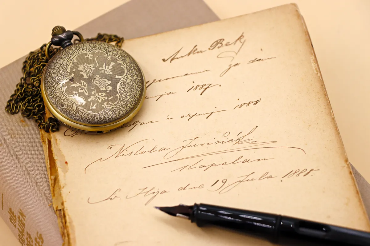
Photo Credit: Antoni Shkraba
What Broad-Edge Nib Works Well for Blackletter
A medium to wide broad-edge nib generally works best for beginners, since wider strokes make it easier to see mistakes in angle or spacing while still learning. This kind of blackletter pen technique depends far more on holding a steady angle than on any special flexing or pressure control.
Once the angle feels natural on a wider nib, moving to a narrower size becomes much easier without relearning the whole technique.
Core Blackletter Strokes to Practice
- Practice straight diagonal lines first. These form the backbone of most Blackletter letters and establish your pen angle.
- Add short horizontal connectors. Many letters use small horizontal strokes to link diagonal sections together.
- Work on sharp corner turns. Blackletter relies on crisp angles rather than rounded transitions between strokes.
- Practice small connecting hairlines. These thin strokes link larger shapes without breaking the pen angle.
How Do You Keep Blackletter Strokes Consistent
Consistency in Blackletter comes almost entirely from maintaining the same pen angle across every single stroke, since even small angle shifts noticeably change stroke weight. Practicing on guideline paper with clear height markers also helps keep letters uniform in size across a full line.
Repeating the same basic stroke across an entire line before moving to the next one builds far more consistency than practicing several different strokes together too soon.
Pro Tips and Common Mistakes to Avoid
- Do not rotate the pen mid stroke. Even small angle shifts create uneven thick and thin contrast across letters.
- Avoid pressing harder for thicker lines. Blackletter contrast comes from pen angle, not added pressure on the nib.
- Do not skip straight line practice. Diagonal strokes form the foundation nearly every letter builds from.
- Watch your ink flow. Thicker inks used with broad edge nibs can dry inside the reservoir if left uncapped, so clean your nib after each session.

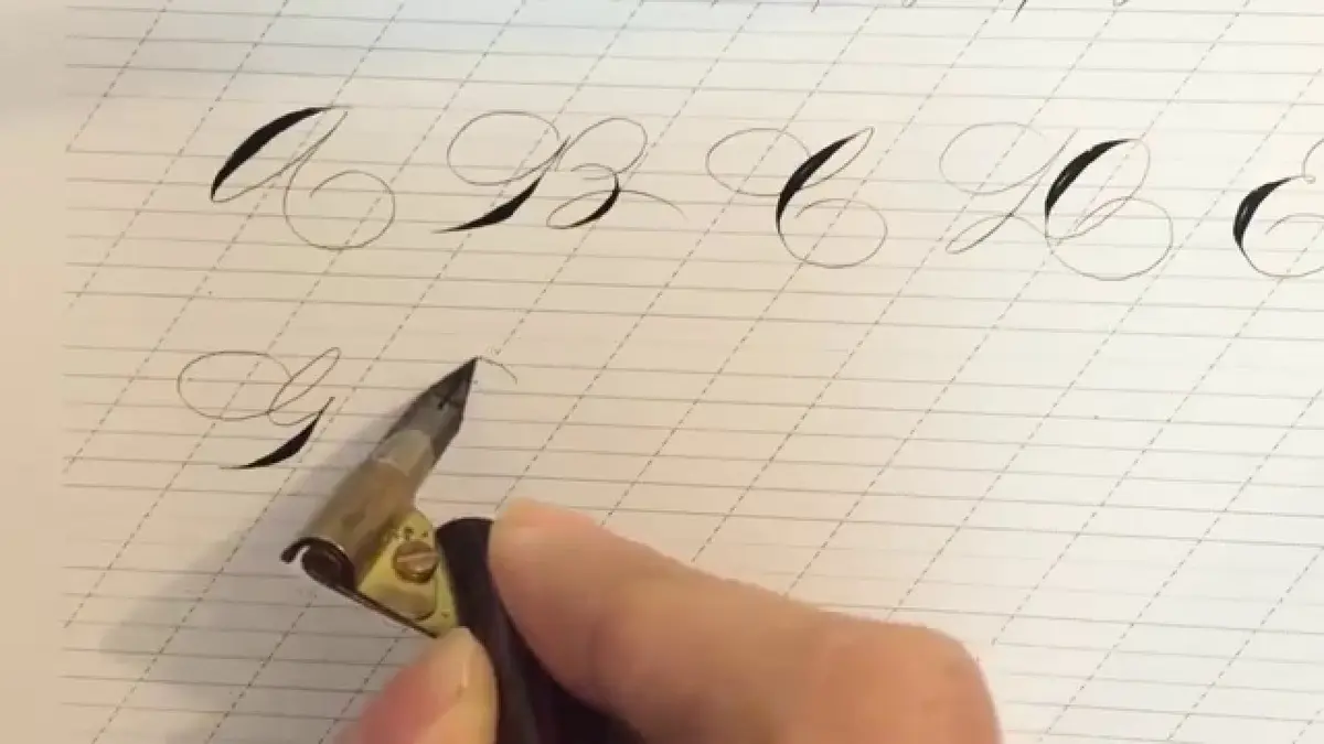
Photo Credit: Emily Palmer
Frequently Asked Questions
What basic strokes form Blackletter letters? Straight diagonal lines, sharp corners, and short connecting hairlines combine to form nearly the entire alphabet.
What pen angle is used for Blackletter? Most Blackletter styles use a consistent 40 to 45 degree angle held steady throughout every stroke.
What broad-edge nib works well for Blackletter? A medium to wide broad edge nib suits beginners best, since larger strokes make angle mistakes easier to spot.
How do you keep Blackletter strokes consistent? Maintain the same pen angle throughout every stroke and practice on guideline paper with clear height markers.
Angles Over Curves
Blackletter basic strokes reward a steady, consistent pen angle far more than pressure control or flexing skill. Practice the core shapes, hold that angle steady, and the bold, structured look of this script will start coming together naturally.
For everything else this hobby covers, from tools to strokes to full scripts, read the full calligraphy and hand lettering guide.


Leave a Reply