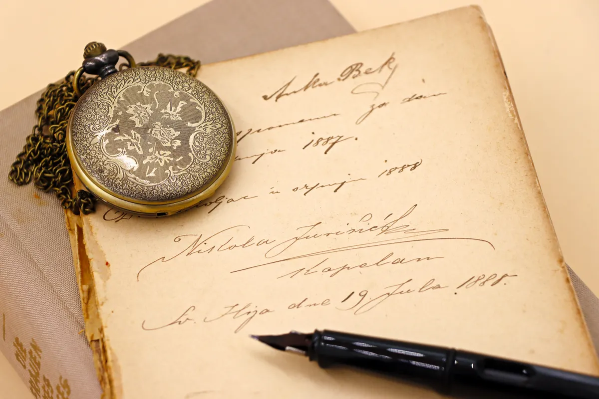
I still have the first alphabet practice sheet I ever filled out, ink blotches and all. Looking at it now, I can see exactly what I was missing: a few simple ideas about what calligraphy is, where its letters came from, and what the words on the practice guide meant. These calligraphy basics are those ideas, laid out in plain language.
By the end, you will know how calligraphy differs from handwriting, how the main scripts developed, which ones suit beginners, and the terms you will hear in every lesson. If you want the big picture first, go Back to the complete calligraphy & hand lettering guide.
What Is Calligraphy?
Calligraphy is the art of beautiful writing. You form each letter with planned strokes in a steady style, so the writing itself looks good on the page. The word comes from Greek words meaning "beauty" and "to write."
How is that different from ordinary handwriting? Handwriting is made for speed and personal habit. Your "e" today may not match your "e" from yesterday, and that is fine for a grocery list. Calligraphy follows a chosen style, with set stroke shapes, a set slant, and even spacing, so every letter looks like a close relative of the others.
Another difference is pace. In calligraphy, you slow down and build each letter on purpose. Speed comes later, and only after control. For a closer look at the definition, read our page on What Is Calligraphy?
What Is Hand Lettering?
Hand lettering is the art of drawing letters. You do not write the word in one flowing motion. You sketch it, shape each letter, and often add thickness, shadows, or small details.
Because you can erase and redraw, hand lettering is forgiving. Every letter in a piece can have its own size and shape, and the style can change from one word to the next. A pencil, a fine pen, or a marker is all you need to start.
Here is a simple way to remember the two arts. If you follow the strokes of a script, you are doing calligraphy. If you design each letter as a picture, you are hand lettering. Plenty of artists mix both in one piece, and our guide to Calligraphy vs Hand Lettering explains where the line sits.
History of Calligraphy
For most of history, every book, letter, and legal paper was written by hand. People called scribes spent years learning to make clear, steady letters. Calligraphy grew out of that need, and its scripts changed as tools, materials, and tastes changed.
Here is a rough timeline for the Latin alphabet, the one used for English. Dates are approximate, because scripts shifted slowly and overlapped.
- Roman capitals. Carved and painted in ancient Rome, these shaped the capital letters we still use.
- Uncial. A round, wide script used in early handwritten books, starting around the 4th century.
- Carolingian minuscule. A clear small-letter script that spread widely around the year 800 and helped shape modern lowercase letters.
- Blackletter (Gothic). Dense, angular lettering common in later medieval Europe.
- Italic. A fast, slanted, graceful hand that grew in Renaissance Italy, around the 15th century.
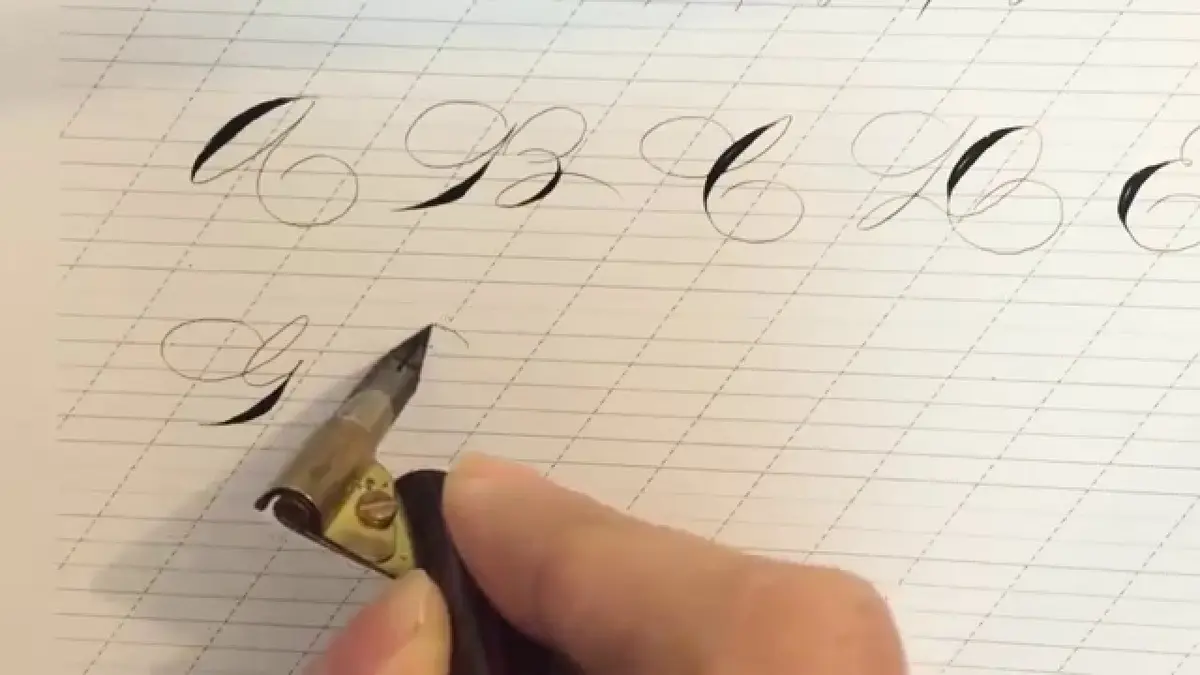
- Copperplate. A flowing pointed-pen script tied to writing masters and engravers in the 1600s and 1700s.
- Spencerian. A light, oval script made popular in 19th century America.
- The modern revival. In the early 1900s, an English teacher named Edward Johnston helped bring back broad-edge pen calligraphy, and many people have kept it going since.
Printing changed the picture. Once movable type spread through Europe in the 1400s, most books were no longer copied by hand. Calligraphy did not vanish. It became an art form and a skill for special documents.

Photo Credit: Hobby Guidebook Editorial
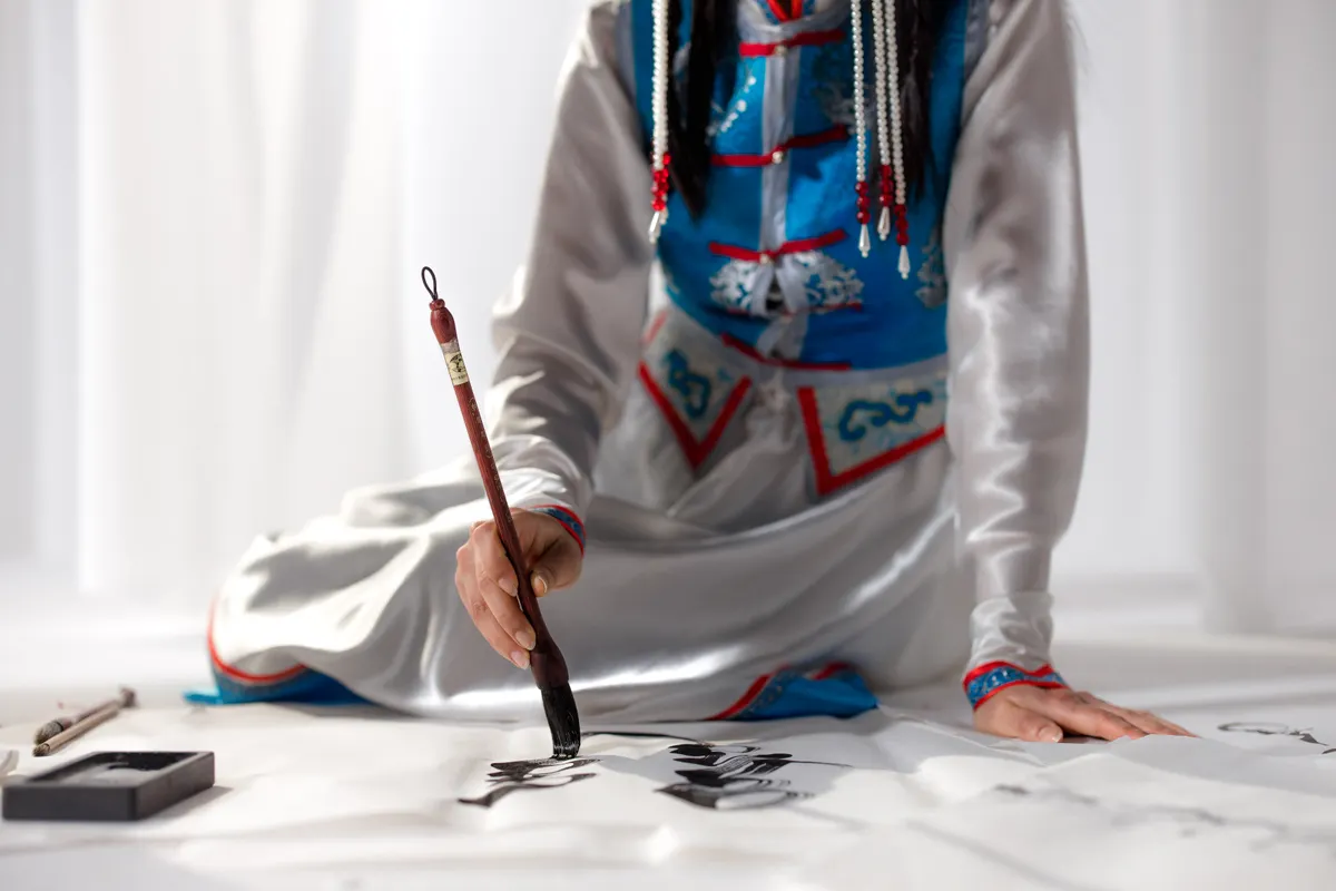
Calligraphy is also much bigger than the Latin alphabet. Arabic, Chinese, Japanese, Persian, and Hebrew calligraphy each have deep traditions with their own tools and rules. This guide focuses on Latin-alphabet scripts, so a rule here may not apply to those traditions.
Why does history matter to a beginner? Because old scripts explain today's habits. Our lowercase letters came from small, quick scripts, and our capitals came from carved stone. When you know that, letter shapes stop feeling random. You start to see why an italic "a" looks the way it does, and why a blackletter page looks so dark. That understanding makes practice feel less like copying and more like learning a language.
Types of Scripts
A script is a full style of letters with its own shapes and habits. The easiest way to sort scripts is by the tool that makes them, because the tool decides how thick and thin lines appear.
|
Script |
Main tool |
Look |
How thick and thin lines happen |
|
Italic |
Broad-edge nib or marker |
Slanted, oval, clean |
Pen angle |
|
Foundational hand |
Broad-edge nib |
Round, open, upright |
Pen angle |
|
Uncial |
Broad-edge nib |
Wide and round |
Pen angle |
|
Blackletter |
Broad-edge nib |
Dark, tight, angular |
Pen angle |
|
Copperplate |
Pointed nib |
Slanted, thin, flowing |
Pressure |
|
Spencerian |
Pointed nib |
Light, oval, graceful |
Pressure |
|
Modern calligraphy |
Pointed nib or brush pen |
Loose, bouncy, personal |
Pressure |
|
Brush lettering |
Brush pen |
Smooth and rounded |
Pressure |
Three groups to remember
You do not need to memorize every script. Remember three groups.
- Broad-edge scripts. The tip is flat, like a small chisel. Hold it at a steady angle and the flat edge makes thick and thin lines on its own.
- Pointed-pen scripts. The tip is sharp and flexible. Light pressure makes a thin line, and more pressure spreads the tip for a thick one.
- Brush scripts. A brush pen reacts to pressure much like a pointed pen does.
Common scripts for beginners
No single script is best for everyone, but a few are common starting points.
- Italic. The pen angle does most of the work, so you can focus on shape and rhythm.
- Foundational hand. Its round, open letters make a clear model for learning how letters are built.
- Modern calligraphy or brush lettering. A small, firm brush pen feels relaxed, and the look is popular on cards and in journals.
Copperplate and Spencerian are lovely, but they ask you to control pressure and shape at once, which many people find easier after some practice. Choose the look you enjoy most, because you will practice it more.
How to try a script without a big spend
You do not have to buy a full kit to find out what you like. A broad-edge marker is a cheap way to test italic, and a small brush pen lets you try modern lettering the same afternoon. Print a free practice sheet for the script, slide it under thin paper, and trace a few letters. Tracing teaches your hand the shapes before you try them alone.
Give each script a fair trial of a couple of weeks before you judge it. Early practice always looks rough, and that tells you very little about whether a style suits you. If you enjoy the sessions, even the messy ones, you have probably found a good match.
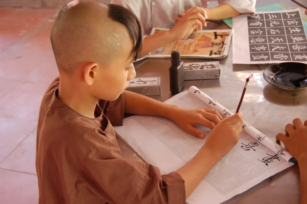
Photo Credit: Mike Tyurin
From Traditional to Modern Calligraphy
Traditional calligraphy follows the rules of a historic script closely. The slant, the letter proportions, and the stroke order are fixed, and the goal is to match the model.
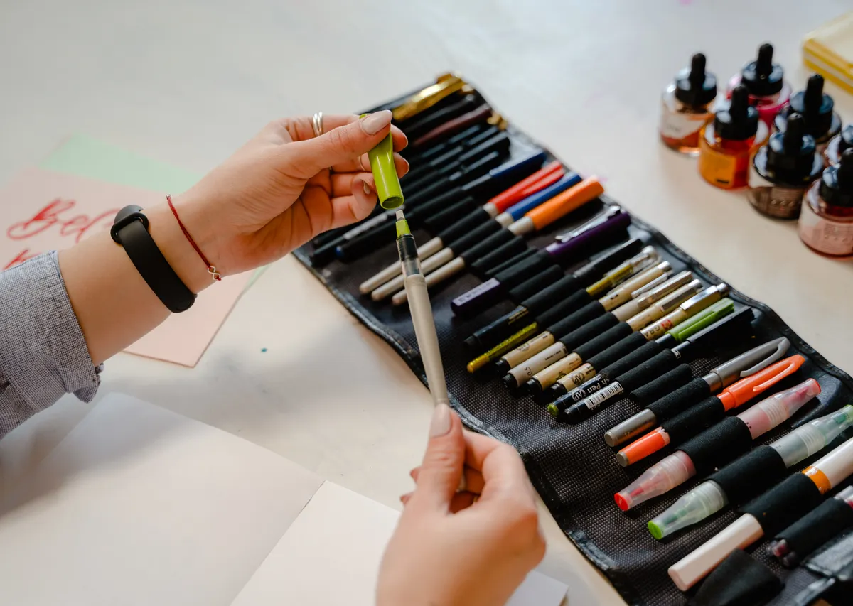
Modern calligraphy keeps the pointed pen or brush but relaxes the rules. Letters may bounce above and below the line, slants may vary, and spacing can feel loose and personal. Tools changed too. Brush pens and markers mean you can start in minutes, with no dipping and no cleanup.
Neither way is "more real." Many calligraphers learn a traditional script first, because it teaches control, and then bend the rules in their own style. Others begin with modern lettering and add traditional scripts later.
What stays the same is the groundwork. Whether the style is strict or loose, you still need a relaxed grip, light guidelines, steady strokes, and even spacing. Modern calligraphy that looks careless is usually built on very careful habits. The loose look works because the basics underneath it are sound.
Calligraphy Terminology
These are the words you will meet in almost every lesson. Learn them early, and practice sheets will make a lot more sense.
|
Term |
Plain meaning |
|
Baseline |
The line your letters sit on |
|
x-height |
The height of small letters like "a," "e," and "o" |
|
Ascender |
The part of a letter that rises above the x-height, as in "b" or "h" |
|
Descender |
The part that drops below the baseline, as in "g" or "p" |
|
Nib |
The metal tip of a dip pen |
|
Pen angle |
The angle between the pen's edge and the baseline |
|
Upstroke |
A stroke made while moving the pen up the page |
|
Downstroke |
A stroke made while moving the pen down the page |
|
Serif |
A small foot or finishing stroke on a letter |
|
Flourish |
A decorative swirl added to a letter or word |
|
Minuscule |
Small, or lowercase, letters |
|
Majuscule |
Capital, or uppercase, letters |
A few extra notes help. In pointed-pen work, upstrokes are usually thin and downstrokes are usually thick. Spacing between letters matters as much as the letters themselves. And the exact meaning of some terms can vary a little between schools and traditions, so use a lesson's own definitions when they differ.
Two more ideas show up often. Slant is how far your letters lean, and a good script keeps the same slant from the first letter to the last. Spacing is the gap between letters and words. Even spacing makes a line of calligraphy look calm, and uneven spacing is one of the first things the eye notices. Both are easier to check when you step back from the page and look at the whole line instead of one letter.

Photo Credit: MART PRODUCTION
Pro tips and common mistakes
Grip trips up more beginners than anything else. I can often tell within a stroke or two whether someone's grip is fighting the pen or working with it, and tight fingers are the usual clue. Hold the pen lightly and let it glide.
- Skipping guidelines. Letters drift in size and slant without them. Rule light pencil lines every time.
- Rushing. Fast strokes look shaky. Slow down until the line is smooth.
- Pressing too hard. Heavy pressure can wear a brush tip or spread a nib too far.
- Skipping the stroke practice. Letters are strokes joined together, so practice strokes first.
- Handling nibs carelessly. Pointed nibs have a sharp tip, so cap or store them after each session, and keep ink bottles closed and upright.
Get it right first, and the speed will follow. That old rule of thumb among letterers holds true for almost every stroke you will ever make.
Calligraphy Basics FAQ
What is calligraphy and how is it different from ordinary handwriting?
Calligraphy is beautiful writing made with planned strokes in a chosen style. Handwriting is made for speed and varies from day to day. Calligraphy values control, even spacing, and a steady look.
What are the main historical types of calligraphy?
For the Latin alphabet, the main historical scripts are Roman capitals, uncial, Carolingian minuscule, blackletter, italic, copperplate, and Spencerian. Many other writing systems, such as Arabic and Chinese, have their own long calligraphy traditions.
What are the most common calligraphy scripts for beginners?
Italic, foundational hand, and brush-pen modern calligraphy are common starting points. Italic and foundational hand rely on pen angle, which many beginners find steady to learn. Brush lettering feels relaxed and quick to start.
What basic terms should every new calligrapher know?
Start with baseline, x-height, ascender, descender, nib, pen angle, upstroke, and downstroke. These words describe where letters sit, how tall they are, and how the pen moves.
How has calligraphy changed from traditional to modern practice?
Traditional calligraphy follows strict historic rules, while modern calligraphy relaxes them and allows a looser, more personal look. Brush pens and markers have also made it much easier to begin without dip-pen setup.
Your Next Step
You now have the core of calligraphy basics: what it is, how it grew, which scripts to look at first, and the words that describe it all. Pick one script that catches your eye and keep your first practice sheet, blotches and all. Then Read the full calligraphy & hand lettering guide to see where to go next.


Leave a Reply