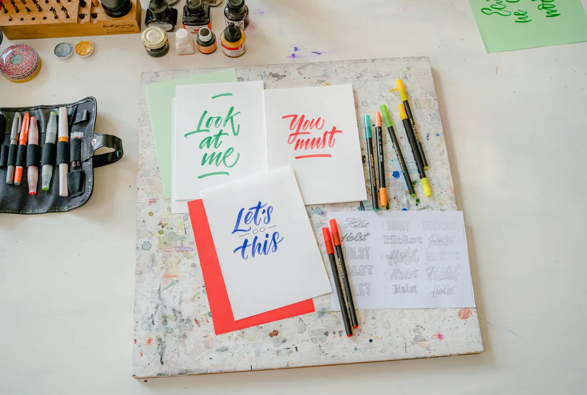
Write the word "hello" so the letters hop up and down like a ball on a string, and suddenly a plain greeting looks playful. That is bounce lettering, and it is one of the quickest ways to make a simple word feel alive. The trick is making it bounce without making it hard to read.
This guide is part of Calligraphy Scripts & Lettering Styles Explained. You will learn what the style is, how it changes the baseline, which tools work well, and how to keep your words clear.
I still have the first alphabet sheet I ever filled in, ink blotches and all. Bounce lettering came much later, once my basic letters were steady enough to move around on purpose.
What Is Bounce Lettering?
Bounce lettering is a style where letters shift up and down from the line they would normally sit on. Some letters rise a little, some drop a little, and the whole word gets a bouncy rhythm. It is often built on top of brush lettering or modern calligraphy, though you can use other pens too.
The name tells you the idea. The letters bounce. Beyond that, the details vary a lot from one letterer to the next, and there is no single official rulebook.
|
Feature |
Bounce lettering |
|
Main idea |
Letters move above and below the baseline |
|
Base style |
Often brush lettering or modern calligraphy |
|
Look |
Playful, rhythmic, casual |
|
Best for |
Short words, names, and quotes |
|
Tools |
Brush pens, fine pens, pencil guides |
You can think of it as a layer added to a style you already know. If you are new to the base style, start with brush lettering first. Your bounce will look much better once your letters themselves are steady.
Some people use the term bounce lettering style for any word that looks bouncy, even if the letters are drawn with regular pens. Others save it for brush pen work. Both uses are common, so do not let the labels distract you.
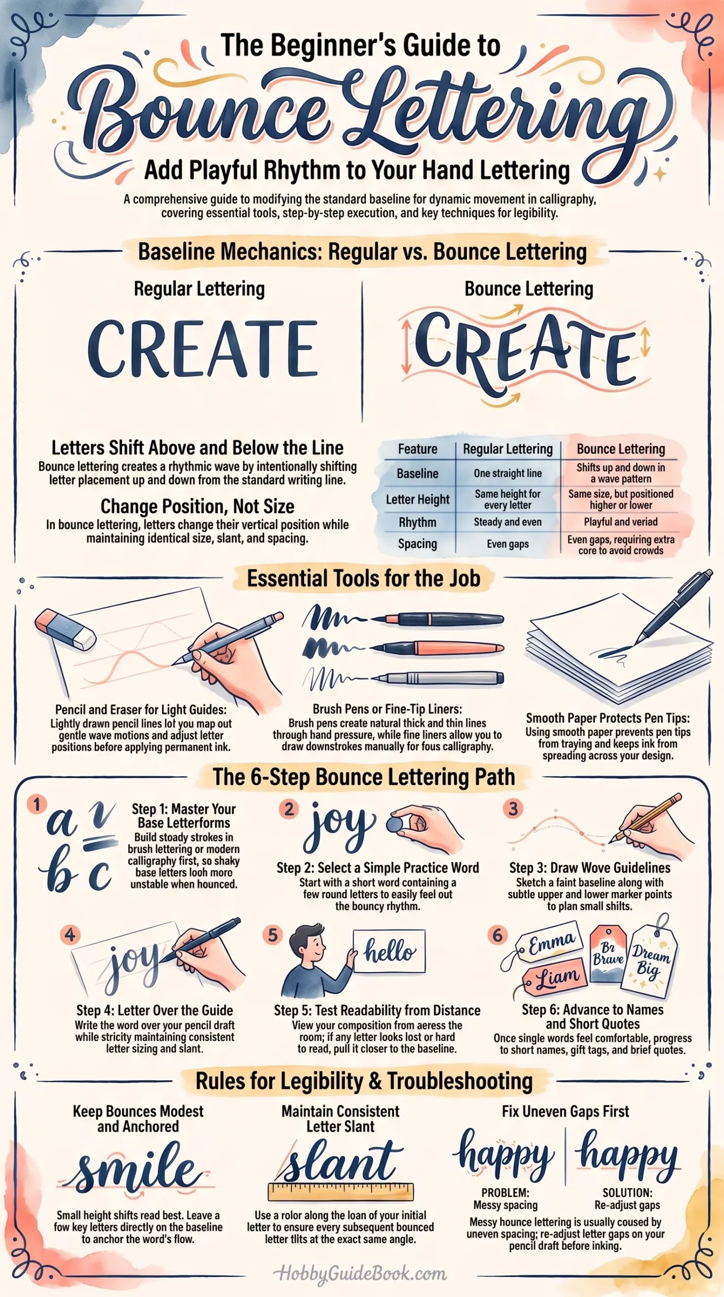
Photo Credit: Hobby Guidebook Editorial
How Does Bounce Lettering Change the Normal Baseline?
The baseline is the line your letters normally sit on. In regular writing, every letter touches it. In bounce lettering, the baseline becomes more like a suggestion. Letters sit slightly above it or slightly below it, in a pattern that feels like a wave.
|
|
Regular lettering |
Bounce lettering |
|
Baseline |
One straight line |
Shifts up and down |
|
Letter height |
Same for every letter |
Same size, different position |
|
Rhythm |
Steady and even |
Playful and varied |
|
Spacing |
Even gaps |
Even gaps, with extra care |
Notice that the letters themselves do not change size. Only their position changes. That is the main idea to hold onto. If you also stretch or shrink letters at random, the word falls apart quickly.
Where Bounce Lettering Is Used
People use it for greeting cards, gift tags, journal pages, posters, and social posts. It suits short words and names, where the playful rhythm is easy to follow. Long paragraphs in bounce lettering are tiring to read, so most people save it for headings and quotes.
What Tools Work Well for Bounce Lettering?
A pencil, an eraser, and a pen you like are enough to start. The pen can be a brush pen, a fine liner, or a marker.
|
Tool |
Why it helps |
|
Pencil and eraser |
Light guidelines you can rub out |
|
Brush pen |
Pressure gives natural thick and thin lines |
|
Fine-tip pen |
Lets you draw thick lines yourself |
|
Smooth paper |
Keeps tips from fraying and ink from spreading |
|
Ruler |
For straight guidelines |
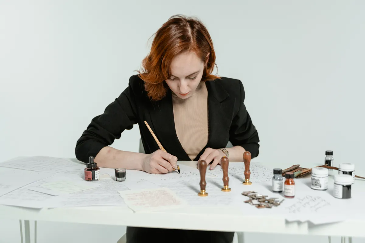
A fine-tip pen is the tool behind faux calligraphy, where you draw a second line beside each downstroke and fill it in. This is how many people create a faux calligraphy bounce without a brush pen. If you prefer brush pens, the brush pens for lettering page covers how to choose.
Keep pens capped when you are not using them so the tips stay in good shape. Work in a bright spot, and take breaks to rest your hand.
Practice on cheap paper first, then move to your good sheet once the plan feels right. Erasing pencil guides after the ink is dry keeps smudges off the finished word. A lightly drawn guide also lets you adjust one letter without redrawing the whole line.
Photo Credit: Pragyan Bezbaruah
How to Make Letters Bounce Without Losing Readability
The fun part is easy. The skill is in keeping the word readable. These habits help:
- Keep the bounce small. A modest shift reads better than a big drop.
- Keep letter size the same. Only the position should change.
- Keep the slant consistent. Letters should lean the same way, even when they move.
- Keep spacing even. Bounced letters still need steady gaps.
- Let some letters stay put. A few letters on the baseline anchor the word.
Plan it in pencil first. Draw a baseline, then mark small up and down positions for each letter, like a gentle wave. Write the word lightly, check how it reads, and only then go over it with ink.
If you can read it from across the room, the bounce is working.
That is a handy test for any playful lettering. If a letter looks lost, move it back toward the line.
A Simple Learning Path
Is bounce lettering suitable for beginners? It can be, as long as your basic letters are steady first. The bounce adds a layer of planning, and shaky letters will look shakier when they move.
- Learn your base style. Brush lettering or modern calligraphy both work well.
- Practice a simple word. Pick one with a few round letters.
- Draw a guide. Use a light baseline and small up and down marks.
- Write over the guide. Keep size and slant steady.
- Check it from far away. Fix any letters that look lost.
- Try a short name or quote. Build up slowly.
If you are starting from modern letterforms, see modern calligraphy for the base style. When you are ready for step-by-step drills, bounce lettering technique goes through the method in detail.
Photo Credit: MART PRODUCTION
Common Mistakes to Avoid
- Bouncing every letter. The word becomes noisy and hard to read.
- Changing letter size. It breaks the rhythm.
- Skipping the pencil plan. Without guides, the bounce drifts.
- Making big drops. Letters lose their link to the word.
- Rushing. Slow strokes give you cleaner lines.
Fixing a Word That Looks Messy
If the word feels off, look at the gaps first. Bounced letters often crowd each other or leave holes, and uneven spacing is the most common reason a word looks messy. Redraw your guide with the gaps adjusted.
Next, check the slant. One letter leaning the wrong way stands out right away. Lay a ruler along the lean of your first letter and compare the rest.
Last, count your bounces. If nearly every letter moves, try keeping two or three on the baseline. Fewer moves usually read as cleaner and more confident.
Frequently Asked Questions
What is bounce lettering?
It is a lettering style where letters move up and down from the baseline to give a playful, rhythmic look.
How does bounce lettering change the normal baseline?
The baseline stops being a straight line. Letters sit a little above or below it, but they stay the same size.
How do you make letters bounce without losing readability?
Keep the bounce small, keep letter size and slant steady, and leave a few letters on the baseline.
What tools work well for bounce lettering?
A pencil for guides, plus a brush pen or fine-tip pen. Smooth paper helps protect pen tips.
Is bounce lettering suitable for beginners?
Yes, once your basic letters are steady. Plan each word in pencil before inking.
Start With One Word
Pick a short word you like, sketch a gentle wave in pencil, and let the letters follow it. Your first try will not look perfect, and that is fine.
When you are ready for the bigger picture, read the full calligraphy & hand lettering guide.




Leave a Reply