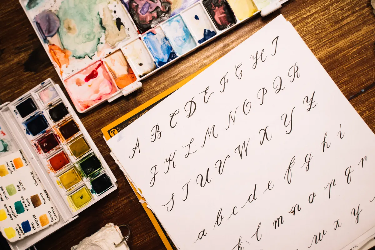
I still remember the first time a student handed me a page full of beautifully smooth lowercase Copperplate, only to watch their confidence collapse the moment they tried a capital letter. Copperplate uppercase letters genuinely feel like learning a second alphabet, and understanding why makes the practice ahead far less frustrating.
This guide is part of Copperplate Calligraphy, and it covers why these capitals behave so differently and how beginners can approach them without getting discouraged.
Why Are Copperplate Uppercase Letters Different From Lowercase
Copperplate lowercase letters follow fairly repetitive, connected patterns built from a small handful of core shapes. Copperplate uppercase letters work almost the opposite way, since each capital often has its own unique construction, complete with loops, swells, and decorative flourishes that do not repeat elsewhere in the alphabet.
This difference exists partly for historical reasons. Traditional penmanship treated capitals as a chance for visual flair at the start of a word, while lowercase letters needed to stay simple and fast to write in long passages.

Photo Credit: Hobby Guidebook Editorial
Background on Practicing Copperplate Capitals
Because each capital is essentially its own small drawing, copperplate capital letters practice tends to take longer than lowercase practice, and that is completely normal. I have found that students often need to slow down considerably here, since rushing capitals leads to shaky, uneven curves far more often than with lowercase letters.
For a broader look at how these two letter groups compare across scripts in general, Calligraphy Alphabets: Uppercase vs Lowercase Overview is a helpful companion resource.
Tools for Practicing Copperplate Capitals
|
Tool |
Purpose |
Notes |
|
Pointed flexible nib |
Creates thick and thin swells on capitals |
A slightly stiffer nib helps beginners control large loops |
|
Oblique pen holder |
Keeps proper pen angle for slanted strokes |
Especially useful once capitals include curved flourishes |
|
Calligraphy ink |
Provides smooth, controlled flow |
Consistent viscosity prevents blobbing on wide swells |
|
Slanted guideline paper |
Keeps capital height and slant consistent |
Capitals are typically taller than lowercase ascenders |
Which Copperplate Capitals Are Hardest to Learn
Letters built from multiple overlapping loops tend to challenge beginners the most, since they require careful pressure changes within a single continuous stroke. Capitals like these demand more planning before the pen even touches the paper, compared to simpler, single-curve letters.
I have found that students often benefit from practicing these harder capitals in isolation repeatedly, rather than mixing them randomly with easier letters during early sessions.
"A capital letter carries the weight of the whole word's first impression." That idea comes up often among penmanship teachers, and it explains why so much practice time goes toward getting these letters right.
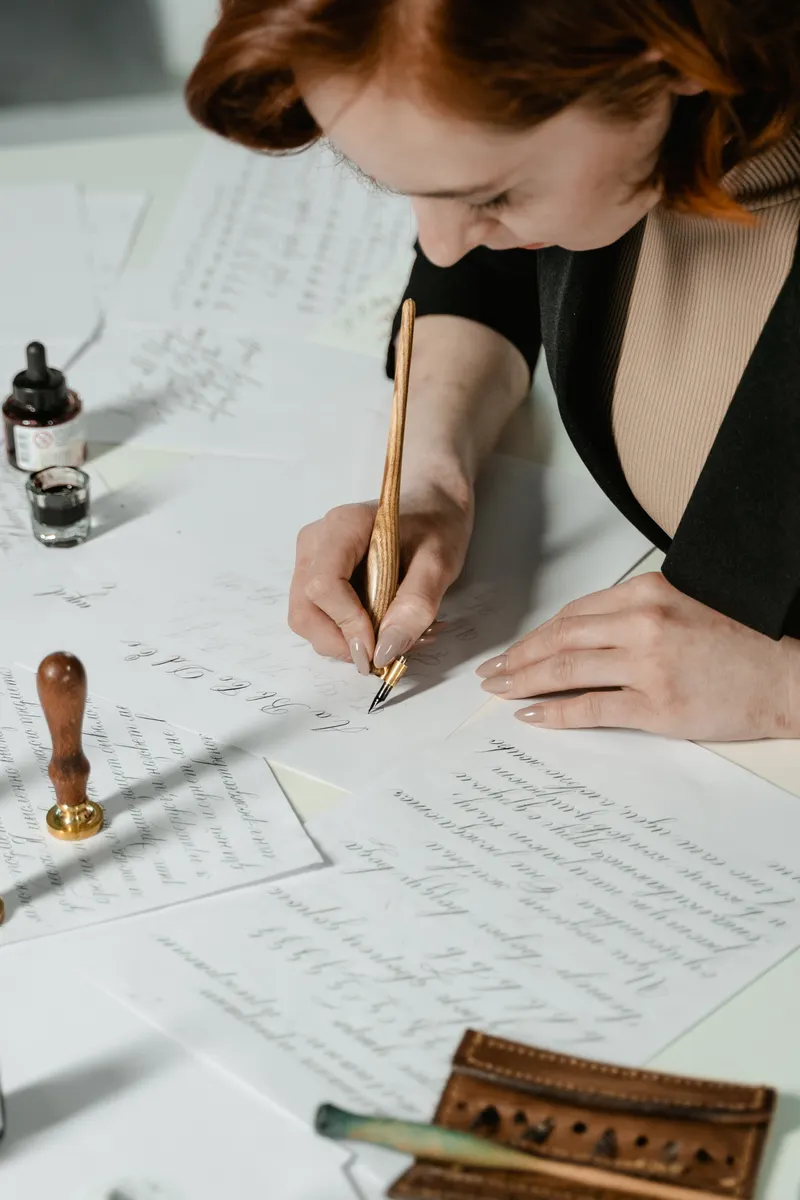
Photo Credit: MART PRODUCTION
How Should Beginners Practice Copperplate Capitals
- Study the letter's stroke order first. Look closely at where a capital begins, loops, and ends before attempting to write it.
- Break the letter into smaller parts. Practicing individual loops or curves separately builds confidence before combining them into the full capital.
- Repeat one letter at a time. Filling a full line with the same capital builds muscle memory faster than jumping between different letters.
- Pair capitals with simple lowercase. Once a capital feels steady, try writing it at the start of a short, familiar word.
How Do You Keep Copperplate Capitals Consistent in Size
Consistent capital height depends heavily on guideline paper, since eyeballing proportions rarely works reliably, even for experienced writers. Most Copperplate guides use a slanted grid with a taller line specifically for capital height.
Beginners should also watch their pen pressure closely, since capitals rely on wider pressure swells than lowercase letters, and uneven pressure often causes size to drift within a single word.
Pro Tips and Common Mistakes to Avoid
- Do not rush wide pressure swells. Applying pressure too quickly creates blobby, uneven curves instead of smooth, tapered shapes.
- Avoid skipping isolated letter drills. Jumping straight to full words before mastering individual capitals often bakes in awkward habits early.
- Do not ignore your guideline slant. Inconsistent slant between capitals and lowercase makes finished words look mismatched.
- Watch your nib angle on loops. Twisting the nib mid-stroke can catch paper fibers and cause ink to spatter unexpectedly.
For comparison, reviewing Copperplate Lowercase Letters alongside capitals helps clarify just how differently these two letter groups are built.
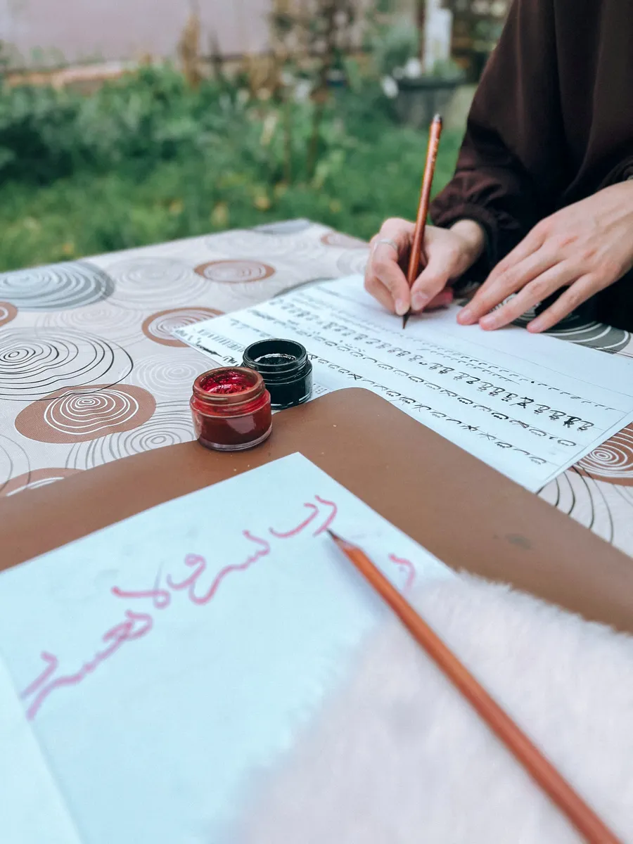
Photo Credit: rabia
Frequently Asked Questions
Why are Copperplate uppercase letters different from lowercase? Capitals were traditionally designed with decorative flourishes for visual flair, while lowercase letters stayed simple for faster, repeated writing.
Which Copperplate capitals are hardest to learn? Letters with multiple overlapping loops tend to challenge beginners most, since they require careful pressure changes within one stroke.
How should beginners practice Copperplate capitals? Break each capital into smaller parts, repeat it in isolation, then pair it with simple lowercase words once it feels steady.
How do you keep Copperplate capitals consistent in size? Use slanted guideline paper with a dedicated capital height line, and keep pen pressure even throughout each swell.
Worth the Extra Practice Time
Copperplate uppercase letters take patience, but that early frustration fades quickly once individual capitals start feeling familiar. Slow down, isolate the tricky loops, and consistency will follow naturally.
For everything else this hobby covers, from tools to strokes to full scripts, read the full calligraphy and hand lettering guide.






Leave a Reply