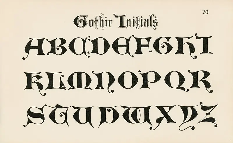
The first time I finished a full word in Blackletter, it looked less like handwriting and more like something pulled straight out of an old manuscript, and that reaction is exactly why this script draws so many beginners in. Blackletter calligraphy stands out immediately with its dense, angular letters that feel dramatic even in a single word.
This guide is part of Calligraphy Scripts & Lettering Styles Explained, and it covers what Blackletter actually is, the tools it needs, and a realistic starting point for learning it yourself.
What Is Blackletter Calligraphy
Blackletter, also called Gothic script, is a broad-edge calligraphy style built from tightly packed, angular letterforms with thick vertical strokes and sharp, pointed details. Unlike flowing pointed pen scripts, Blackletter comes from a flat-edge nib held at a fairly consistent angle, which naturally produces its heavy, dense look.
This gothic script calligraphy style dates back to medieval Europe, where it was used for hand-copied manuscripts and religious texts long before printing existed. That dense, formal appearance was partly practical too, since packing more letters into less space saved expensive parchment.
Background: Where Blackletter Fits Among Calligraphy Styles
Blackletter belongs to the broad-edge nib family, which means it shares more technical similarities with Italic than with pointed pen scripts like Copperplate. The flat edge of the nib, rather than pressure, is what creates the thick and thin contrast in each letter.
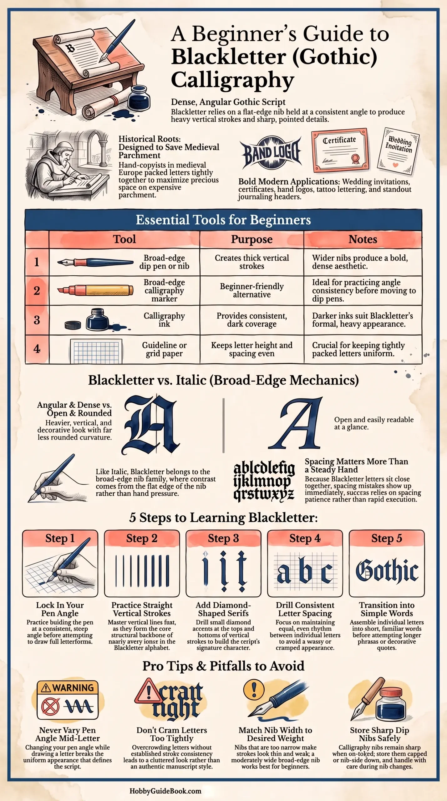
Photo Credit: Hobby Guidebook Editorial
If you already have some broad-edge experience, that foundation transfers well here, since the fundamental pen angle mechanics stay similar even though the letterforms look completely different.
What Is Blackletter Used for Today
Modern uses lean heavily toward decorative and stylistic purposes rather than everyday writing. Blackletter shows up often in wedding invitations, certificates, band logos, and tattoo lettering, where its bold, formal look adds visual weight.
I have found that hobbyists also enjoy Blackletter for journaling headers and quote art, since a single dramatic word or phrase can anchor an entire page without needing much additional decoration.
What Pen or Nib Works Best for Blackletter
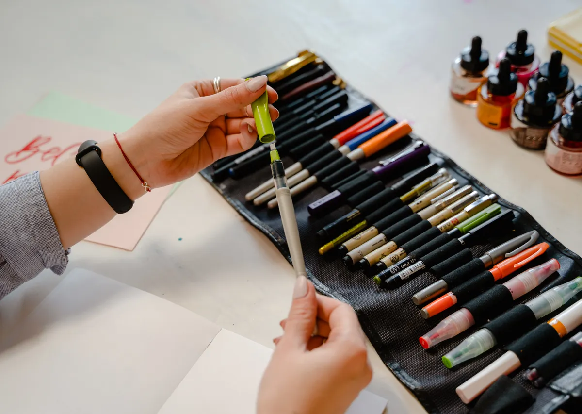
Blackletter requires broad-edge tools, similar to what you would use for Italic, though pen width matters more here due to the script's dense letterforms.
|
Tool |
Purpose |
Notes |
|
Broad-edge dip pen or nib |
Creates the thick vertical strokes |
Wider nibs work well for the bold, dense look |
|
Broad-edge calligraphy marker |
Beginner-friendly alternative |
Good for practicing angle consistency before dip pens |
|
Calligraphy ink |
Provides consistent, dark coverage |
Darker inks suit Blackletter's bold, formal appearance |
|
Guideline or grid paper |
Keeps letter height and spacing even |
Especially useful given how tightly packed letters sit |
A moderately wide nib tends to work best for beginners, since it makes the thick strokes obvious without requiring extremely precise pen control right away.
Is Blackletter Difficult to Learn
Blackletter has a bit of a deceptive reputation. The individual strokes are not necessarily harder than other broad-edge scripts, but consistency becomes tricky because the letters sit so close together.
Photo Credit: cottonbro studio
Spacing mistakes show up immediately in Blackletter in a way they do not always in more open scripts. I have found that beginners who focus on consistent letter width and spacing early, rather than rushing into full words, tend to avoid the cramped, uneven look that trips up a lot of first attempts.
"Blackletter rewards patience with spacing more than it rewards a steady hand." That idea gets repeated often among broad-edge calligraphy teachers, and it holds up well once you compare a rushed attempt against a slower, more deliberate one.
How Is Blackletter Different From Other Broad-Edge Scripts
Compared to Italic, Blackletter letters are noticeably more angular, dense, and vertical, with far less rounded curvature. Italic tends to feel more open and readable at a glance, while Blackletter leans into a heavier, more decorative appearance.
If you want a clearer sense of how a more approachable broad-edge script compares, Italic calligraphy is worth reading alongside this guide, since many hobbyists actually learn Italic first before moving into Blackletter.
Getting Started With Blackletter Step by Step
- Practice your pen angle first. Most Blackletter work uses a consistent, fairly steep pen angle, so getting comfortable with that angle alone before attempting letters saves frustration later.
- Draw straight vertical strokes. These form the backbone of nearly every letter in the blackletter alphabet, so repetition here pays off quickly.
- Add diamond-shaped serifs. Many Blackletter letters include small diamond details at the top and bottom of strokes, which take a bit of practice to place consistently.
- Work on consistent letter spacing. Since letters sit close together, practicing even spacing between individual letters matters as much as the letterforms themselves.
- Move into simple words. Once individual letters feel steady, try short, familiar words before attempting longer phrases.
For a deeper breakdown of these individual strokes with more repetition drills, Blackletter basic strokes walks through each shape in more detail.

Photo Credit: Guillermo Sifuentes
Pro Tips and Common Mistakes to Avoid
- Do not vary your pen angle mid-letter. Inconsistent angles are one of the fastest ways to break the uniform look Blackletter depends on.
- Avoid cramming letters too tightly too soon. Some spacing is intentional, but overcrowding without practice usually looks messy rather than authentic.
- Do not skip serif practice. These small details are easy to rush, but they add much of the script's distinctive character.
- Watch your nib width choice. A nib that is too narrow can make the bold strokes look thin and weak instead of dense and confident.
A quick safety note as well. Dip pen nibs stay sharp even when not in use, so store them capped or nib-side down, and take care when swapping nibs between different pen holders.
Frequently Asked Questions
What is Blackletter calligraphy? Blackletter is a broad-edge script known for dense, angular letters with thick vertical strokes, originating from medieval European manuscripts.
What is Blackletter used for today? Modern uses include wedding invitations, certificates, logos, tattoo lettering, and decorative journaling headers.
What pen or nib works best for Blackletter? A broad-edge dip pen or calligraphy marker with a moderately wide nib works well for beginners starting this script.
Is Blackletter difficult to learn? The individual strokes are manageable, but consistent spacing between tightly packed letters takes real practice to master.
How is Blackletter different from other broad-edge scripts? Blackletter is more angular and dense than Italic, which feels more open and rounded by comparison.
A Bold Script Worth Trying
Blackletter takes a bit of patience with spacing and angle consistency, but the dramatic result makes the practice genuinely satisfying. Start with straight strokes and steady spacing, and full words will come together faster than you expect.
For everything else this hobby covers, from tools to strokes to full scripts, read the full calligraphy and hand lettering guide.




Leave a Reply