
I switched from Blackletter to Italic years ago expecting an easy break, and instead spent a week fighting letters that kept leaning the wrong direction. Italic basic strokes look simple on paper, but they depend on a specific slant and pen angle that takes real practice to hold steady.
This guide is part of Italic Calligraphy, and it covers the core strokes, pen angle, and drills behind this fast, elegant broad edge script.
What Basic Strokes Make Up Italic Letters
Italic basic strokes center around a compressed, slightly slanted oval shape, along with straight diagonal branches that connect into that oval from different angles. Unlike rounder scripts, Italic letters stay narrow and upright leaning, which gives the whole alphabet its brisk, efficient look.
These same shapes repeat constantly throughout the alphabet, which is exactly why chancery italic strokes feel so approachable once the basic oval and branch motion clicks for a new writer.
Background on Italic's Efficient Design
Italic developed in Renaissance Italy as a faster alternative to more formal, heavily decorated scripts used at the time. That practical history explains why Italic strokes stay simple and quick, favoring speed and legibility over the elaborate flourishes found in scripts like Blackletter.
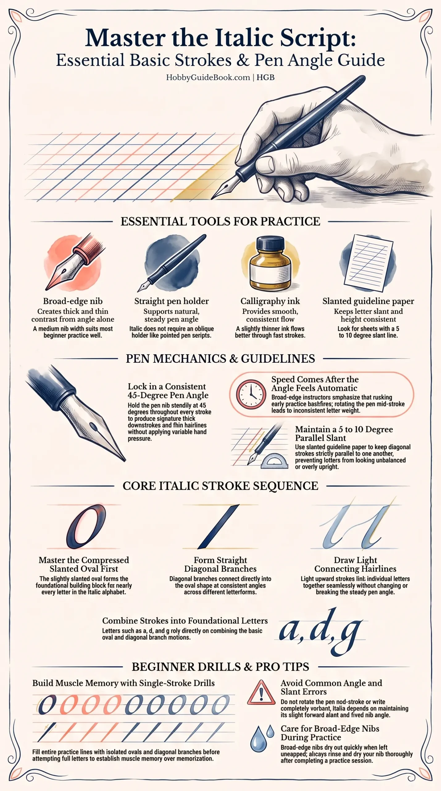
Photo Credit: Hobby Guidebook Editorial
Before diving into full letters, it helps to be comfortable holding the pen correctly, and How to Hold a Calligraphy Pen Correctly covers grip basics that make these strokes far easier to control.
Tools for Practicing Italic Strokes
|
Tool |
Purpose |
Notes |
|
Broad-edge nib |
Creates thick and thin contrast from angle alone |
A medium nib width suits most beginner practice well |
|
Straight pen holder |
Supports natural, steady pen angle |
Italic does not require an oblique holder like pointed pen scripts |
|
Calligraphy ink |
Provides smooth, consistent flow |
A slightly thinner ink flows better through fast strokes |
|
Slanted guideline paper |
Keeps letter slant and height consistent |
Look for sheets with a 5 to 10 degree slant line |
What Pen Angle Is Used for Italic Calligraphy
Italic typically uses a consistent 45 degree pen angle held steady throughout each stroke, similar in principle to Blackletter but paired with a lighter, quicker hand. Holding this angle steady is what creates Italic's signature thick downstrokes and thin connecting hairlines without any extra pressure from the writer.
I have found that students who rotate the pen slightly mid stroke end up with inconsistent letter weight, even when the actual hand motion looks smooth on the page.
"Speed comes after the angle feels automatic, not before." That advice gets repeated often among broad edge instructors, and it explains why rushing early practice usually backfires.
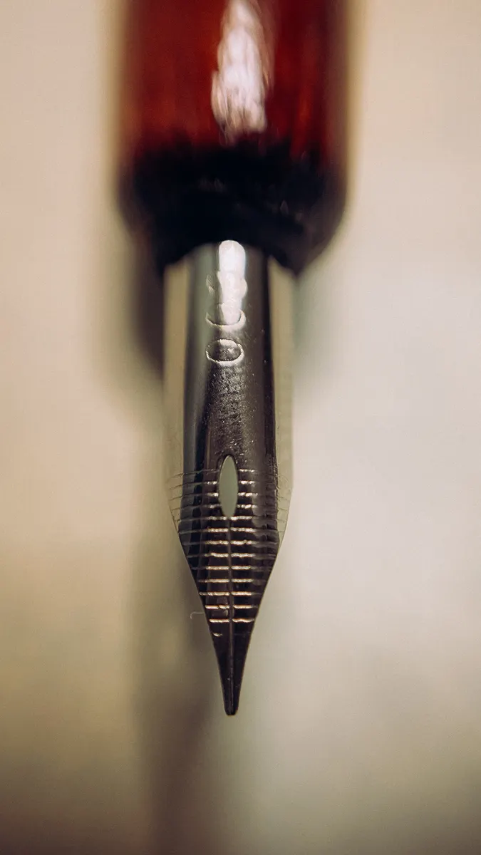
Photo Credit: Kristina Ohrband
How Do You Keep Italic Strokes Parallel and Consistent
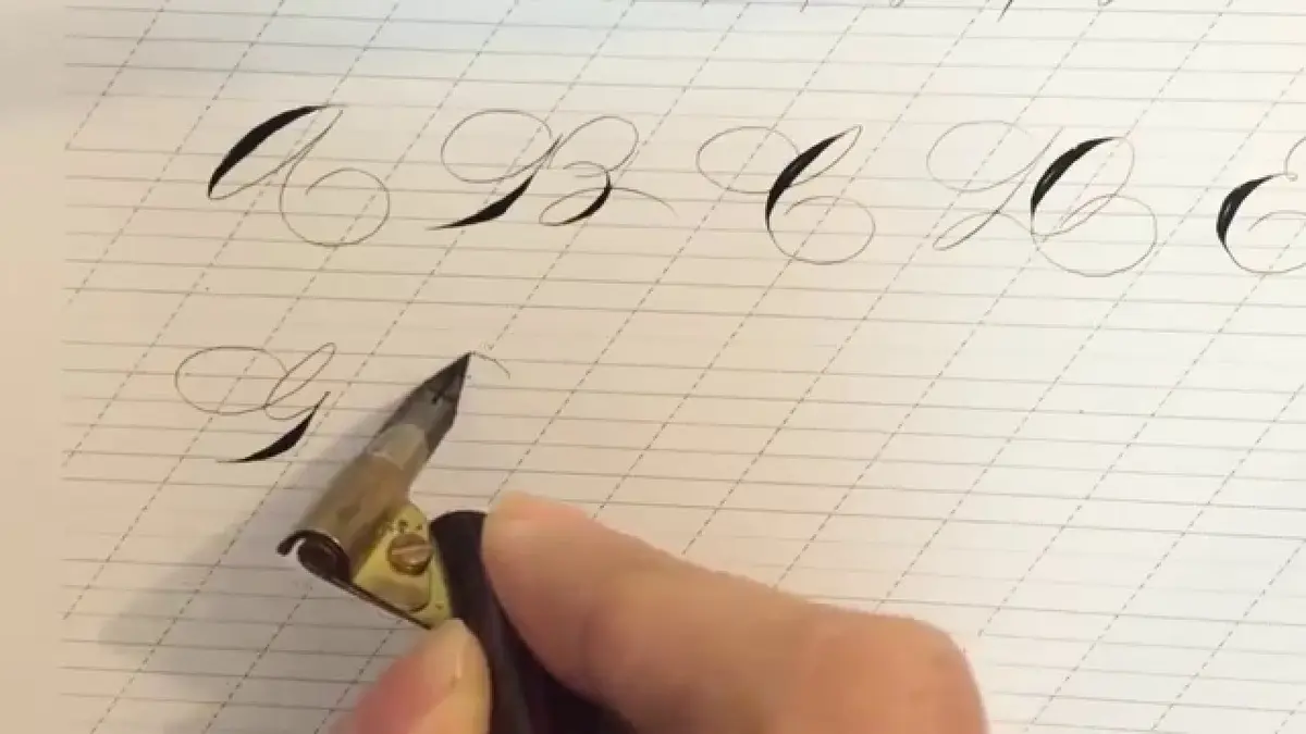
Consistency in Italic comes largely from keeping diagonal strokes parallel to each other, since even small angle shifts noticeably change how balanced a finished letter looks. Slanted guideline paper helps enormously here, since judging a 5 to 10 degree slant by eye alone is genuinely difficult for most beginners.
This italic pen technique also benefits from working slowly at first, since rushing the pen tends to break that steady parallel angle before it becomes automatic.
Core Italic Strokes to Practice
- Practice the basic oval shape first. This slightly slanted oval forms the foundation nearly every Italic letter builds from.
- Add straight diagonal branches. These connect into the oval at consistent points and angles across different letters.
- Work on thin connecting hairlines. Light upward strokes link letters together without breaking the pen angle.
- Combine ovals and branches into simple letters. Letters like a, d, and g rely directly on this oval and branch combination.
What Drills Help Beginners Master Italic Strokes
Repetition drills help far more than jumping straight into full letters, since Italic's simple shapes reward steady muscle memory over quick memorization. Filling an entire line with just the basic oval shape, then a full line of diagonal branches, builds the coordination needed before combining them into real letters.
Once these basic strokes feel steady, Italic Alphabet Practice covers how to build the full lowercase and uppercase alphabet from this same stroke foundation.
Pro Tips and Common Mistakes to Avoid
- Do not rotate the pen mid stroke. Even small angle shifts create uneven thick and thin contrast across letters.
- Avoid writing too upright. Italic depends on its slight slant, so letters that stay perfectly vertical lose their character.
- Do not skip oval practice. This shape underlies most of the alphabet, so rushing past it slows down later progress.
- Watch your ink flow. Broad edge nibs can dry out if left uncapped between sessions, so rinse and dry your nib after practice.
Photo Credit: MART PRODUCTION
Frequently Asked Questions
What basic strokes make up Italic letters? A compressed slanted oval and straight diagonal branches combine to form most letters in the alphabet.
What pen angle is used for Italic calligraphy? Most Italic styles use a consistent 45 degree angle held steady throughout each stroke.
How do you keep Italic strokes parallel and consistent? Slanted guideline paper and slow, steady practice help maintain the 5 to 10 degree slant across letters.
What drills help beginners master Italic strokes? Repeating the basic oval and diagonal branch strokes across full lines builds the coordination needed before full letters.
A Fast Script Worth Slowing Down For
Italic basic strokes reward patient, steady practice even though the finished script looks quick and efficient. Master the oval and branch motion first, and the rest of this elegant alphabet will follow with far less struggle.
For everything else this hobby covers, from tools to strokes to full scripts, read the full calligraphy and hand lettering guide.




Leave a Reply