
I once lettered a wedding sign at three times my normal practice size and watched letters I could nail blindfolded suddenly wobble and sprawl across the page. Calligraphy looks different at different sizes for reasons that have nothing to do with skill slipping, and once you understand what actually shifts, scaling up or down gets far less frustrating.
This guide is part of Common Calligraphy Questions & Comparisons, and it covers why size changes everything, whether your nib needs to change too, and how to keep proportions steady no matter the scale.
Why Does Calligraphy Look Different When Written at Different Sizes
Letters change appearance across sizes mainly because the ratio between stroke width and letter height shifts, even when the tool stays exactly the same. I have found that a nib built for small practice work tends to produce thinner relative lines at a larger size, making letters look thin and sparse instead of bold and balanced.
Scaling calligraphy letters is not just enlarging the same shapes, it usually requires adjusting pressure, tool size, or both to keep that same visual weight.
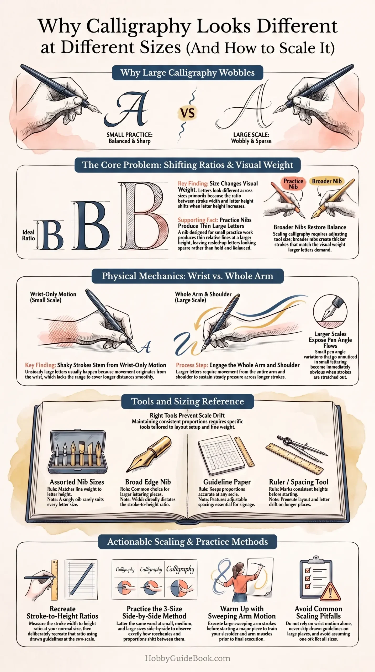
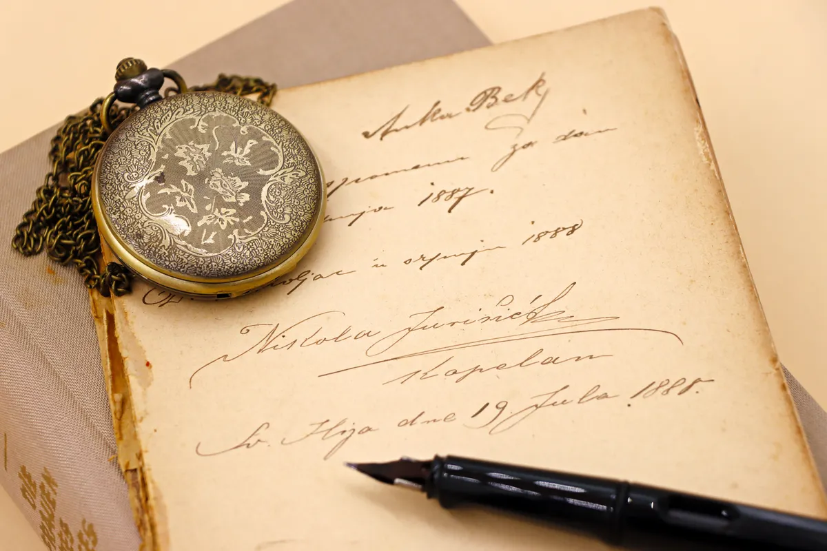
Photo Credit: Hobby Guidebook Editorial
Tools That Affect Size Consistency
|
Tool |
Role in Sizing |
Notes |
|
Assorted nib sizes |
Match line weight to letter height |
A single nib rarely suits every size |
|
Broad edge nib |
Common for larger lettering pieces |
Width affects stroke ratio directly |
|
Guideline paper with adjustable spacing |
Keeps proportions accurate at any scale |
Essential for signage or large pieces |
|
Ruler or spacing tool |
Marks consistent height before starting |
Prevents drift on longer pieces |
Does Nib Size Need to Change With Letter Size
Yes, nib size often needs to change as letter size grows, since a nib that looks proportionate at two inches tall can look thin and weak once scaled up to six inches. Broader nibs create thicker strokes that better match the visual weight larger letters need.
If you are unsure which size fits your project, Calligraphy Nib Size Chart breaks down which nib widths pair naturally with which letter heights.
How Do You Keep Proportions Consistent at Larger Sizes
Keeping proportions consistent starts with measuring the ratio between stroke width and letter height at your normal practice size, then recreating that same ratio deliberately at the new size. Draw guidelines before starting any larger piece, since freehand estimating tends to drift the longer a line of lettering runs.
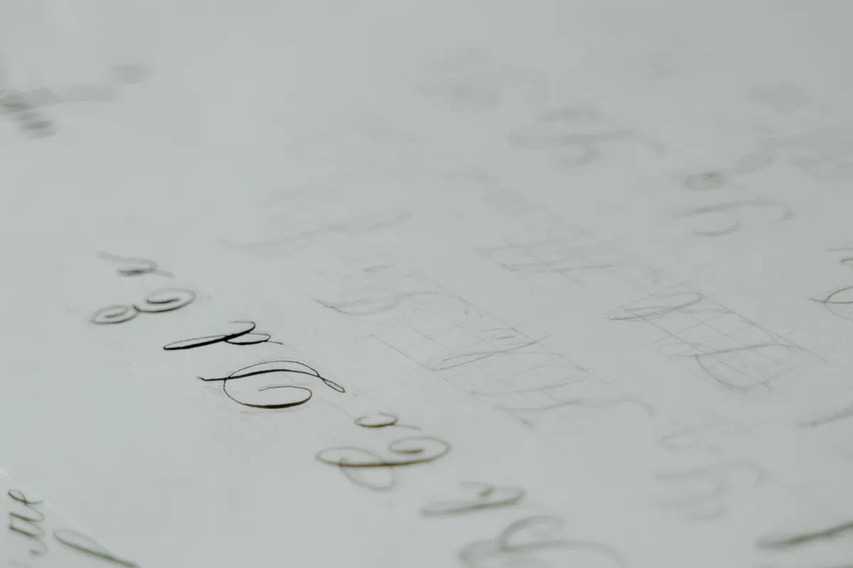
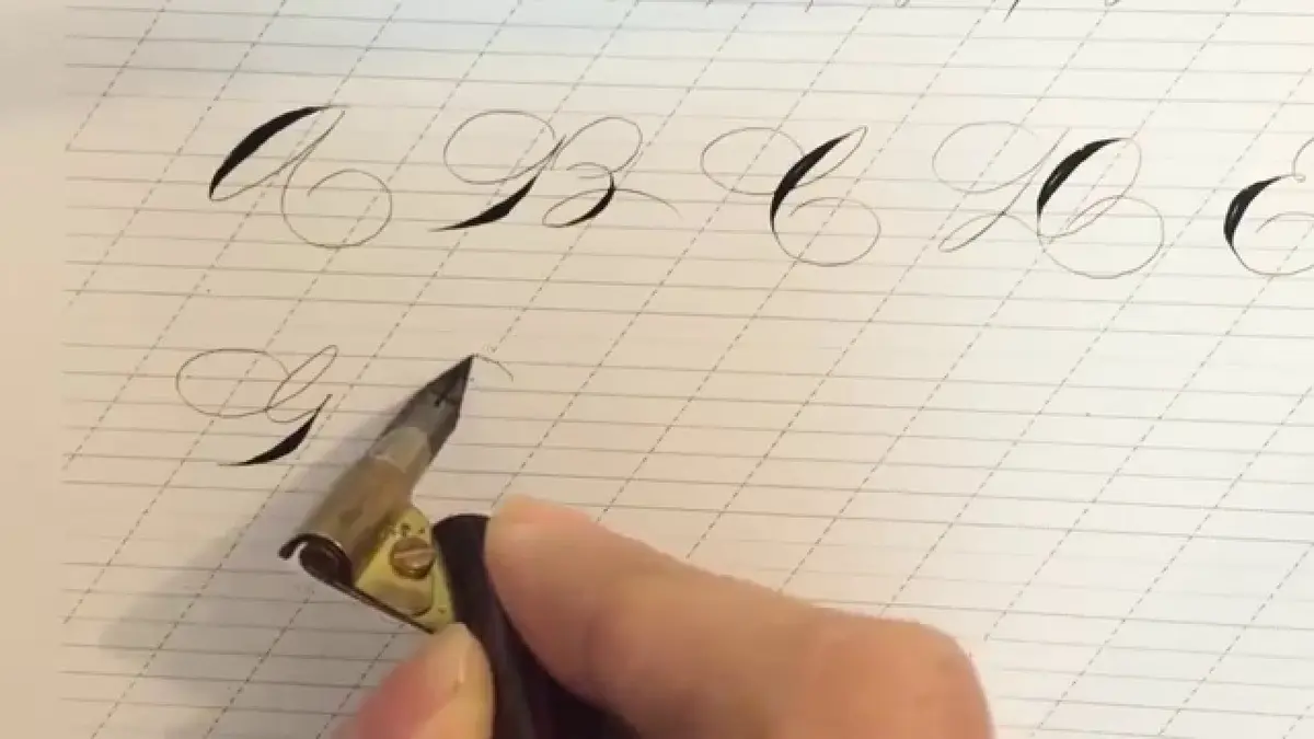
Photo Credit: MART PRODUCTION
Working from a scaled up printed reference, rather than guessing proportions from memory, also helps keep letters looking like the same script at any size.
Why Can Large Calligraphy Letters Look Less Controlled
Large letters often look less controlled because bigger strokes require more arm movement and sustained pressure, both of which are easy to underestimate coming from smaller practice work. Shaky large strokes usually mean the movement is coming from the wrist instead of the whole arm, since wrist only motion struggles to cover longer distances smoothly.
"Bigger letters ask more of your whole arm, not just your hand." That advice gets repeated often among letterers moving into signage work, and it holds up well once you notice how much steadier large strokes feel once the shoulder and arm join in.
Pen angle also becomes more noticeable at larger sizes, since small inconsistencies that barely show in tiny letters become obvious once every stroke is stretched out. Calligraphy Pen Angle & Grip Reference covers how to keep that angle steady as movement scales up.
What Practice Helps You Scale a Script Successfully
Practicing the same word at three different sizes side by side is one of the most effective ways to build real calligraphy size consistency, since it forces you to notice exactly what changes between them. Start small, move to a medium size, then attempt a larger version, comparing all three before moving forward.
Warming up with large sweeping strokes before a big project also helps your arm adjust before the pressure of a final piece is on the line.
Pro Tips and Common Mistakes to Avoid
- Do not assume one nib works for every size. Match nib width to the scale of your project.
- Avoid skipping guidelines on larger pieces. Drift becomes far more visible the bigger the letters get.
- Do not rely on wrist movement alone for large strokes. Let your whole arm carry longer, bigger motions.

Photo Credit: cottonbro studio
Frequently Asked Questions
Why does calligraphy look different when written at different sizes? The ratio between stroke width and letter height shifts, changing how balanced letters appear.
Does nib size need to change with letter size? Yes, broader nibs usually suit larger letters better than a standard practice size nib.
How do you keep proportions consistent at larger sizes? Measure your usual stroke to height ratio, then recreate it deliberately with guidelines.
Why can large calligraphy letters look less controlled? Bigger strokes need more arm movement, and wrist only motion often struggles to keep up.
What practice helps you scale a script successfully? Write the same word at three sizes side by side to notice exactly what changes.
Scaling Takes Practice, Not Just Confidence
Calligraphy looks different at different sizes because proportion, pressure, and tool size all shift together, not because your skill changes with scale. Practice at a few sizes before your next big project, and that larger piece will feel far less unfamiliar than it did the first time around.
For everything else this hobby covers, from tools to strokes to full scripts, read the full calligraphy and hand lettering guide.



Leave a Reply