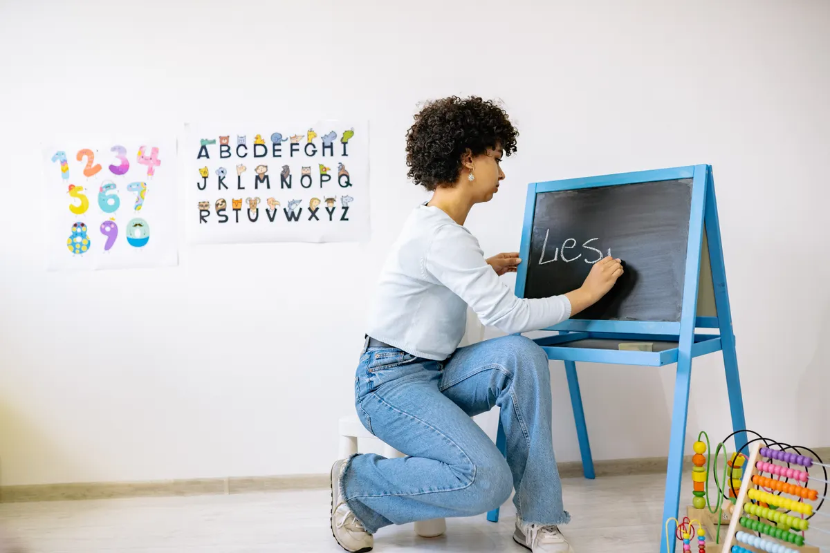
I once spent an entire evening lettering a cafe menu board only to realize halfway through that my letters kept growing taller as I went, and I had to wipe the whole thing clean and start over. Chalkboard lettering alphabet practice is what fixes that exact problem, since it teaches you to plan and repeat letters before committing chalk to the board.
This guide is part of Chalk Lettering, and it covers which alphabet styles work best on chalkboards, how to sketch a layout, and how to keep your finished letters looking consistent from start to finish.
What Is Chalkboard Lettering Alphabet Practice
Chalkboard lettering alphabet practice means working through letterforms on a chalkboard surface until height, spacing, and stroke thickness stay steady across a full line. Unlike paper practice, chalk gives almost no texture feedback, so this chalk alphabet guide approach leans heavily on visual checking rather than feel alone.
This builds directly on the habits covered in Chalk Lettering Technique, which explains the layered strokes and pencil guidelines every alphabet practice session depends on.
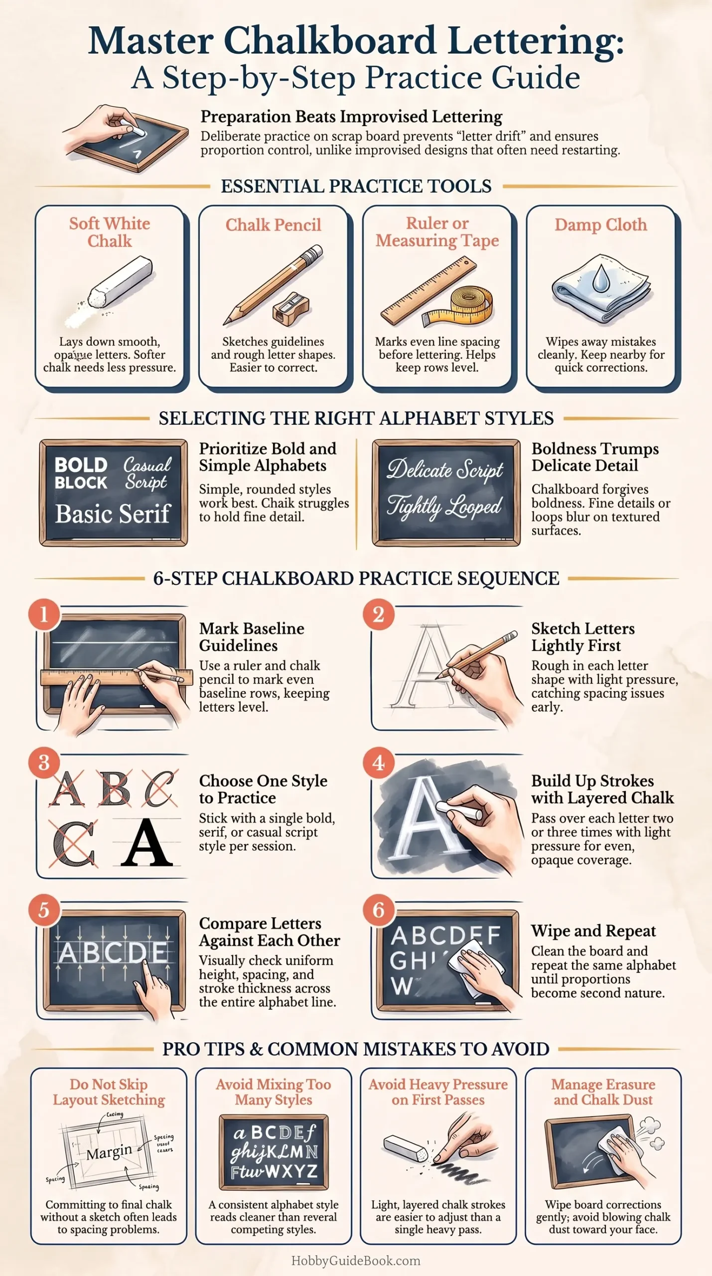
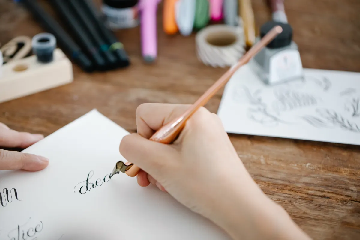
Photo Credit: Hobby Guidebook Editorial
Background on Practicing Letters for Chalkboard Signs
Chalkboard signs became a fixture in cafes and shops because they look warm and hand-done, but the letters behind a clean chalkboard sign lettering project are rarely improvised on the spot. Most sign painters sketch and rehearse their alphabet on scrap board first, since chalk is far harder to erase cleanly mid-design than pencil on paper.
Once your alphabet feels steady, Chalkboard Sign Projects walks through applying these same letters to full sign layouts, menus, and event boards.
Tools for Chalkboard Alphabet Practice
|
Tool |
Purpose |
Notes |
|
Soft white chalk |
Lays down smooth, opaque letters |
Softer chalk needs less pressure to show up clearly |
|
Chalk pencil |
Sketches guidelines and rough letter shapes |
Easier to correct than committing straight to chalk |
|
Ruler or measuring tape |
Marks even line spacing before lettering |
Helps keep rows level across a wide board |
|
Damp cloth |
Wipes away mistakes cleanly |
Keep nearby for quick corrections during practice |
What Alphabet Styles Work Well on Chalkboards
Simple, rounded alphabet styles tend to work best on chalkboards, since chalk struggles to hold fine detail the way a fine tip pen can. Bold block letters, casual script styles, and basic serif alphabets all translate well, while highly detailed or tightly looped scripts often blur together on a textured board.
I have found that beginners get the most consistent results starting with a simple bold alphabet before attempting anything with thin connecting strokes. Save delicate script styles for later, once your hand has built up steady control with simpler letterforms.
"A chalkboard forgives boldness more than it forgives detail." That advice gets repeated often among sign painters, and it explains why bold, simple alphabets tend to photograph and read better than delicate ones.
How Do You Sketch a Chalkboard Lettering Layout
Sketching a layout starts with lightly marking your overall design placement using a chalk pencil, roughing in where each word or line will sit before any final letters go down. This step catches spacing problems early, like a long word that will not fit on one line, before they become a bigger fix later.
Should You Use Guidelines When Lettering a Chalkboard
Yes, guidelines should almost always be used when lettering a chalkboard, since chalk offers very little natural feedback to keep letters level on its own. A ruler or measuring tape helps mark even baseline spacing across rows, which keeps a full alphabet or full sign looking intentional rather than uneven.
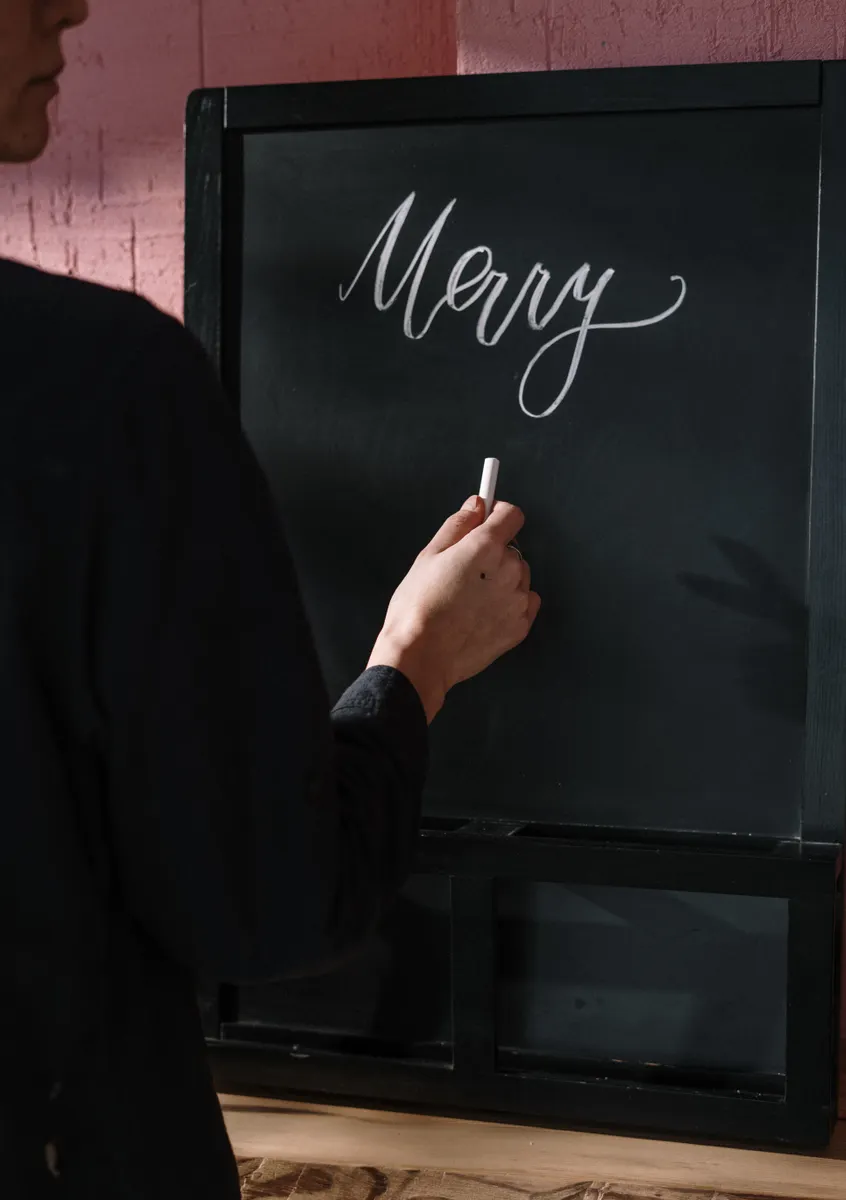
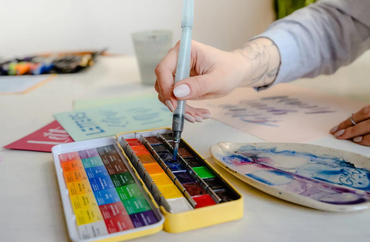
Photo Credit: cottonbro studio
Step-by-Step Chalkboard Alphabet Practice Guide
- Mark baseline guidelines. Use a ruler and chalk pencil to space out even rows across your practice board.
- Sketch letters lightly first. Rough in each letter shape without pressing hard, checking spacing as you go.
- Choose one alphabet style to practice. Stick with a single bold or script style rather than mixing several at once.
- Build up strokes with layered chalk. Go over each letter two or three times with light pressure for even opacity.
- Compare letters against each other. Check that height and spacing stay consistent across the full alphabet line.
- Wipe and repeat. Clean the board and practice the same alphabet again until it feels steady without heavy guideline reliance.
How Do You Make Chalkboard Letters Look Consistent
Consistent chalkboard letters come from repeating the same alphabet style multiple times until your hand memorizes the proportions, rather than moving to a new style every session. Keeping your pencil guidelines visible until the very last step also helps catch drift before it becomes obvious across a finished line.
Pro Tips and Common Mistakes to Avoid
- Do not skip layout sketching. Committing straight to final letters without a rough layout often leads to spacing problems mid-board.
- Avoid mixing too many alphabet styles. One consistent style reads far cleaner than several competing looks on the same board.
- Do not press hard on your first pass. Light layered strokes are easier to correct than one heavy attempt.
- Watch your chalk dust while erasing. Wipe gently with a dry cloth rather than blowing dust toward your face during corrections.
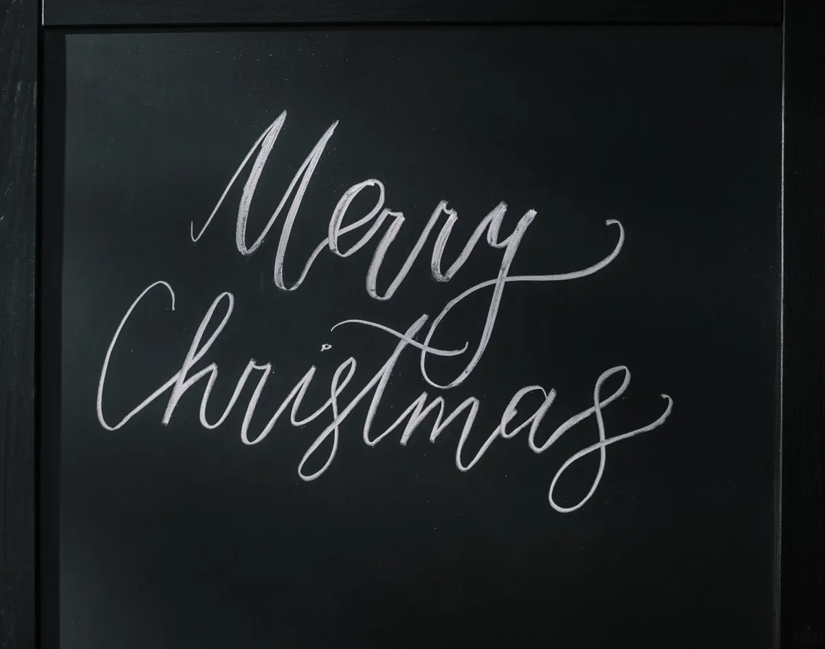
Photo Credit: Antoni Shkraba
Frequently Asked Questions
What alphabet styles work well on chalkboards? Bold block letters, casual scripts, and simple serif alphabets work best, since chalk struggles with fine detail.
How do you sketch a chalkboard lettering layout? Lightly mark placement for each word or line with a chalk pencil before committing to final letters.
Should you use guidelines when lettering a chalkboard? Yes, guidelines keep letters level and evenly spaced, since chalk offers little natural feedback on its own.
How do you make chalkboard letters look consistent? Repeat the same alphabet style across multiple practice sessions until proportions become second nature.
One Steady Alphabet at a Time
Chalkboard lettering alphabet practice rewards a bit of planning before the chalk ever touches the board, and that planning is what separates a clean sign from a messy one. Sketch your layout, stick with one alphabet style, and those letters will start coming out steady line after line.
For everything else this hobby covers, from tools to strokes to full scripts, read the full calligraphy and hand lettering guide.




Leave a Reply